
Design Critiques #4 (Get Your Work Critiqued For Free)
Every week I’ll be encouraging FanExtra members to post their design work for an in depth critique.
Then, the following week I’ll give them in depth, valuable feedback on where they could improve. I’m hoping to also get some of our authors involved to contribute feedback to help you.
This is a really unique chance for you to get some solid feedback on your work.
This series is open to any type of design work. Whether you’d like an opinion on a client web design you’re working on, or you’d like to know how realistic your photo manipulation skills are, please feel free to share your work here. Seriously, logo design, print design, typography, whatever you’re working on, please post it for feedback.
I will personally review every single work you guys comment with, even if it takes me hours ![]() .
.
Just leave a comment to this post with a link to the work that you’d like reviewing
Ester Liquori (Website Redesign Analysis)
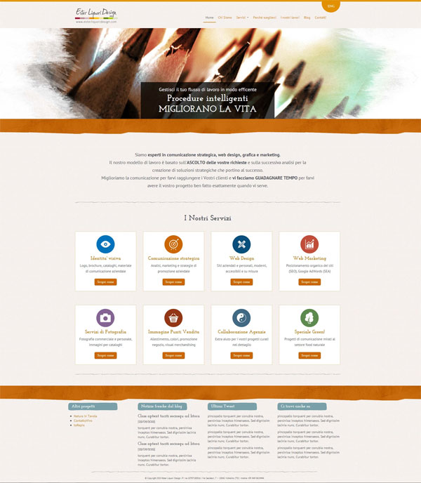
For this week’s design critique I’m excited to analyze the redesign concept for Ester Liquori’s website.
This design has not yet replaced her current version, but Ester was keen to get another opinion on her upcoming redesign.
Let’s take a look at what she’s been working on:
Initial Thoughts
Overall I think Ester has done a great job on her redesign.
It is very simple and clean and your eye naturally flows down the page.
The list of services is very well ordered and I like the helpful icons.
Here are my thoughts for how to improve your design though:
Suggestion 1: Continue Your Brand Throughout the Site
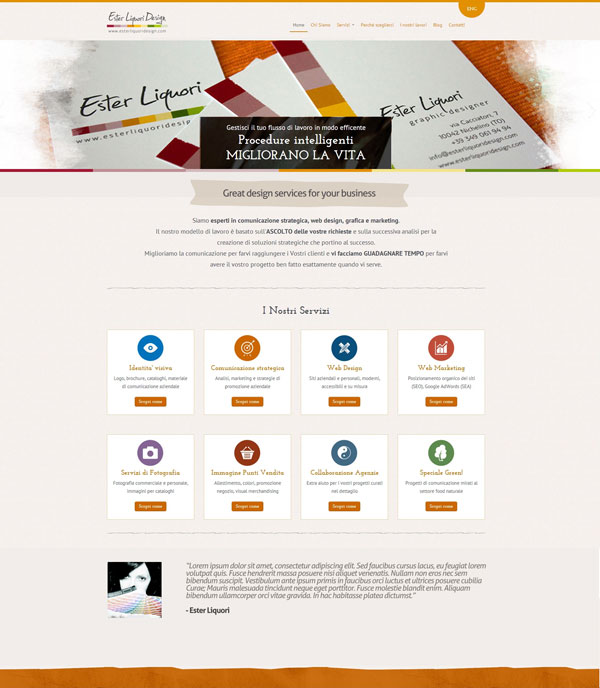
I love the brand established by your logo. The representation of a color swatch board works really well.
Although I like the overall design, it edges on feeling a little generic. Many WordPress themes tend to have a very similar layout, and you don’t want to fall into the trap of feeling like your site is a template, rather than a custom design.
To help with this, I would definitely echo this brand visual throughout your site. In my quick rework of your redesign I replaced the somewhat generic looking orange bar with a staggered colorful bar, using your logo’s colors.
Suggestion 2: Show Off Your Work
I think it’s a real shame that your redesign isn’t showing off your work more. I’m not sure if the large pencil image is a design of yours, but either way, it feels like an attractive, generic header photo.
Given that no other part of the page actually shows of your work, you can’t expect your visitors to have to click through to your portfolio sub-page to explore it.
This large header space would be perfect to have an image slider that rotates through some of your best work.
Suggestion 3: Scrap the Unnecessary, Focus on What Drives Business
It’s hard to do, but you need to scrap everything on the page that isn’t driving you more business.
In your redesign the footer feels fairly pointless, yet takes up a lot of room. Your latest blog posts and tweets may interest some of your following, but they’re taking up valuable homepage real estate that could be better used.
I would use this space for something to add credibility to your business, as this is key for attracting new clients. Something like a client testimonial would work well here I think.
My Reworked Redesign
After having a quick tinker with your redesign in Photoshop I’ve come up with a slightly refined concept.
Of course it could be improved on further, but I hope that it demonstrates some of my suggestions for you. I’d love to know what you think.
Look out for the next critique in the series next week!
Comment to Get Free Feedback on Your Work
If you could like feedback on any of your designs, whether finished or not then post a link to the image in the comments to this post.
I will personally critique each and every suggestion that I receive this time next week.
Look out for the next installment of the series, and I hope that you’ll get involved.
 Design Critiques #3 (Get Your Work Critiqued For Free)
 Design Critiques #1 (Get Your Work Critiqued For Free)

Hi Tom,


thank you so much, you have helped me in focusing some points
You are right about the footer so, thank your suggestion, I think I’ll move the twieets to the blog section and I’ll add somewhere the social buttons.
I also love the staggered bar under the slideshow and I’ll work also on this.
You have given me a lot of useful tips, thank you so much!
Hey Ester, thanks for commenting.
I’m so glad that you liked my feedback. Overall I didn’t have too much to add, as I like your design a lot. I’d love to see what you do with my suggestions though, feel free to comment back here with your progress .
.
Very nice! I thought the suggestions were good ones. You do have a neat site, Ester, not a lot of clutter.
Good show, Tom!
Ester, after his review, I took Tom’s advice and re-designed my blog. I think it made me look more professional! Though I love some of the real cute blogs fellow PS’ers have, I wanted mine to be more about my content. That is what Tom recommended. I think it was the best idea yet!
Nice read. Great job, Tom!
Su
Thanks Su! I’m glad that you liked my review.
I still love your new blog Su, there are way less distractions and definitely a better focus on your content.
That being said, I do think you can achieve cute/creative designs that are at the same time clean. It’s all about cutting out the clutter, but that doesn’t mean you need a super clean website that’s corporate or boring.