
Design Critiques #3 (Get Your Work Critiqued For Free)
Every week I’ll be encouraging FanExtra members to post their design work for an in depth critique.
Then, the following week I’ll give them in depth, valuable feedback on where they could improve. I’m hoping to also get some of our authors involved to contribute feedback to help you.
This is a really unique chance for you to get some solid feedback on your work.
This series is open to any type of design work. Whether you’d like an opinion on a client web design you’re working on, or you’d like to know how realistic your photo manipulation skills are, please feel free to share your work here. Seriously, logo design, print design, typography, whatever you’re working on, please post it for feedback.
I will personally review every single work you guys comment with, even if it takes me hours ![]() .
.
Just leave a comment to this post with a link to the work that you’d like reviewing
Steve Drury (Website Analysis)
For this week’s critique I’ll be reviewing the web design of Steve Drury.
I remember redesigning Steve’s Inner Rapport website for him as part of our 30 minute redesigns series, so it’s a pleasure today to analyze Steve’s main website.
Let’s take a look at his current website:
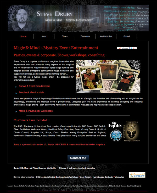
Whilst I typically don’t favor dark websites, I think the color palette works well considering the magical theme.
There are a lot of strong points about the design:
- The relevant, well designed imagery of the header
- The personal touch of Steve’s photo
- A clear, legible menu
- A well designed body image, displaying the magical theme clearly
- Mention of key clients and qualifications
However! It’s not my job to congratulate Steve on his website, it’s my job to critique it.
Here’s a break down of where I think Steve could improve his site:
Loose the Boxy Feel
The layout currently feels very ‘boxy’ and rigid. This is partly due to the border around the main content area, but also down to the straight edges of the header, body photos and even the rigid dividers between menu items.
Remember, it’s good to design within a grid system, but you don’t want your website to feel like a series of boxes put together.
Highlight Your Major Clients
My other main tip would be to highlight your major clients.
The main thing people will be looking for when they find your website is credibility. This is the main component of people’s rational in hiring you.
The fact that you’ve worked for some huge companies including the Royal Air League, BBC and Cambridge University (among others) is very impressive. I don’t think a mere textual mention near the footer of your site is sufficient. I would include these clients right near your site’s header, and include their logos too (be sure to ask for permission from your previous contacts at each company). Your visitors will be quite visual, so logos will give you far more credibility points than text.
Overall: Great Job
Overall, there isn’t a terrific amount more to improve.
I would drop the social sharing box on the right (I’d imagine this never gets used and is distracting).
The copy text looks solid and is concise and helpful.
The menu hover effect feels way too much. Make it a simple text color change, don’t have a garish background image appear and change your text styles.
Perhaps consider the main purpose of your site and include a single, prominent call to action on the homepage (e.g.: ‘Book Me Now!’)
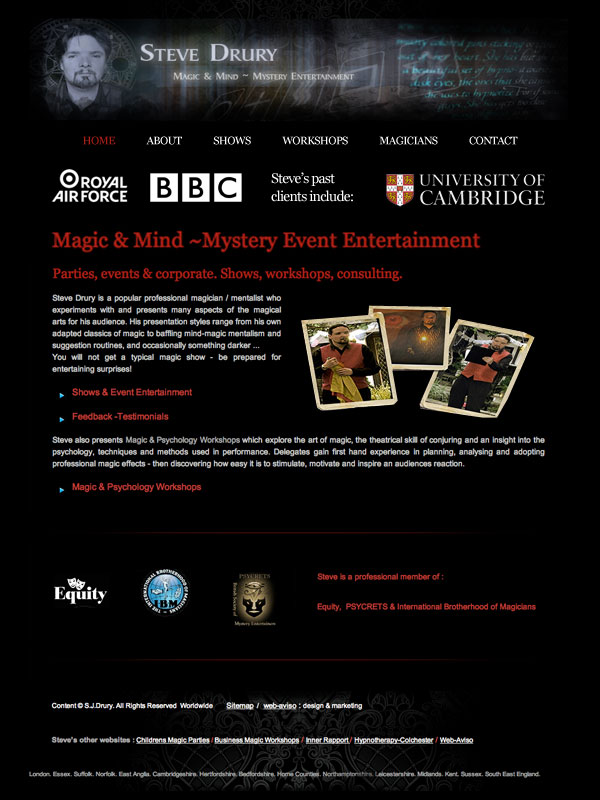
After My Tweaks:
In just a few minutes I was able to make some tweaks to Steve’s website.
Here’s what I did:
- I scrapped the border around his content
- I softened the edges of his header image
- I extracted part of his body photo from it’s background to make it less blocky
- I made the menu text simpler, without rigid dividers
- I included notable client logos near the header for credibility
- I spaced out page elements a little better, giving your content more breathing room.
I hope that you find this critique helpful Steve, and I hope that everyone else can learn some basic web design lessons from this example also.
Look out for the next critique in the series next Friday!
Comment to Get Free Feedback on Your Work
If you could like feedback on any of your designs, whether finished or not then post a link to the image in the comments to this post.
I will personally critique each and every suggestion that I receive this time next week.
Look out for the next installment of the series, and I hope that you’ll get involved.
 Design Critiques #1 (Get Your Work Critiqued For Free)
 Members Area Tutorial: Design a Complete Ecommerce Website (Part 2)

Hi all!
As well as Tom I prefer bright and light colors however the dark background may fits in this case.
I may be wrong but I also think that the general look will be greatly improved by using a slight pattern, something which can give a texture without going heavy.
Again about the palette, if Steve has not be stick to the red, perhaps something like gold or bronze may give an additional touch.
Obviously IMHO!
I’d also appreciate your critique and suggestion about my upcoming new graphic for my website. Please consider it is not intended as a personal freelancer website but as a graphic studio with many service available one.
You can find a preview here:
http://www.esterliquoridesign.com/new-ELD.jpg
Thank you for your time!
Ester