Happy Friday guys!
I always get really excited whenever we launch a new post series, so without further ado I’m pleased to announce the launch of our new Design Critiques Series.
This series is exclusively available to FanExtra members, and I’m hoping it will give you all a lot of value on top of your regular membership.
We have plenty more great new types of content lined up for early 2013, but this series is something I know will benefit many of you.
It’s all well and good learning from expert tutorials and experimenting in Photoshop, but how do you know how much you’ve really progressed without the help of others?
Constructive criticism is a crucial part of becoming a better designer, and whilst comments like ‘great job!’ are good for the ego, they won’t actually help you improve your design hang ups and really push yourself.
So what do we normally do when we’re looking for feedback?
We publish our work on sites like Behance.net and plaster it across our social media accounts. However, often we get little or no feedback, and the feedback we do receive isn’t very helpful.
Introducing FanExtra Design Critiques
Every week I’ll be encouraging FanExtra members to post their design work for an in depth critique.
Then, the following week I’ll give them in depth, valuable feedback on where they could improve. I’m hoping to also get some of our authors involved to contribute feedback to help you.
This is a really unique chance for you to get some solid feedback on your work.
This series is open to any type of design work. Whether you’d like an opinion on a client web design you’re working on, or you’d like to know how realistic your photo manipulation skills are, please feel free to share your work here. Seriously, logo design, print design, typography, whatever you’re working on, please post it for feedback.
I will personally review every single work you guys comment with, even if it takes me hours  .
.
Just leave a comment to this post with a link to the work that you’d like reviewing
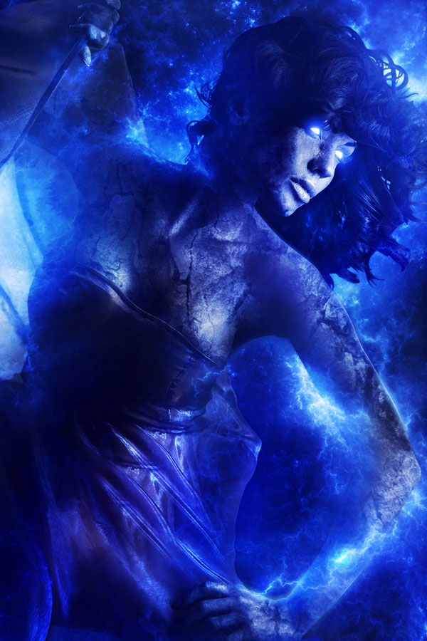
Electric Blue (by Eric Vasquez)
One of our most popular author’s Eric Vasquez has offered up his unreleased work Electric Blue to be our first design critique to get this series going.
Here’s a look at his work:
Let me start by saying that there will certainly be some easier works to review in this series!
Eric is a really talented digital artist, so his work is never going to be something with a ton of flaws.
However, there are certainly some suggestions that I would make with this piece:
Suggestion 1: Cut Down on the Blue
This is a common issue I see with otherwise promising works. Whilst it’s great to use a simple color palette, by limiting yourself to a single color, it can be somewhat overwhelming.
This piece has some great details, and the potential for some wonderful focus points. However, the sheer amount of blue on show obstructs the viewer from noticing and appreciating these strong points. The initial reflection is just an overwhelming amount of blue.
By adding in a wider variety of colors the piece could be more visually intriguing, and allow the eye to wander naturally over the details of the piece.
Suggestion 2: Create More Depth
Considering that the subject in this image appears to emerging from behind a surface, the overall piece actually feels quite flat.
I would definitely incorporate more depth into this piece.
You could achieve this by simply blurring some background details and bringing out the sharpness of what is closest to us.
I would also play with the light/shadow of the piece. If you added more intense shadows over the bottom of the woman’s dress it should give the impression of her emerging from the darkness. By clarifying the light source and accentuating the shadows and depths of the background the piece should gain a more interesting perspective.
Suggestion 3: Sharpen Up
Probably the biggest issue in digital art that seems to separate the great works from the good works.
Areas of your image are beautifully sharp and detailed, such as the woman’s hair. However, much of the surface textures on the skin, especially the cracks/marks on the right arm feel very out of focus. They stand out as a slightly blurred brush effect, rather than a natural part of the woman’s form.
One interesting way to make these marks sharper would be to have blue light leaking out from under the skin surface of the woman. This is already occurring in the woman’s eyes, so naturally any other openings or cracks on the woman’s skin should emit light too. You could come up with some really intricate, fine lines of lighting here.
Suggestion 4: Looser Framing
I’m not 100% on this, but I think the image could look better if the subject was framed more loosely.
Particularly by extending the canvas out to the right you could create a background design that accentuated the depth of the piece (see my second suggestion). Right now, it just feels a little cramped.
Comment to Get Free Feedback on Your Work
If you could like feedback on any of your designs, whether finished or not then post a link to the image in the comments to this post.
I will personally critique each and every suggestion that I receive this time next week.
Look out for the next installment of the series, and I hope that you’ll get involved.
 Artist Breakdown #5. Edmar Cisneros: Herald (Source File Available)
 Artist Breakdown #2. Am I Collective: Verstikland (Source File Available)
 Artist Breakdown #4. José Reis: Painting Your Fury (Source File Available)

Thank you Tom! I certainly appreciate all of your feedback on this unreleased project that I had been working on. I really see some useful tips here and I feel that many of the suggestions you have made here would definitely make the piece stronger.
It’s one of those things where sometimes you just get to a point in a project where you feel like you’ve hit the proverbial wall. I think expanding the canvas, adding some more depth to the background, further contrast and shadows, and the light coming out from the cracks in the skin are all very good ideas and something I will definitely try out in order to make this design feel completed.
Thanks for letting me be the first to get critiqued! I hope that other artists will also see the value in doing something like this, it will only make us better artists in the long run.
Hey Eric. I’m glad the tips were useful for you. I’d love it if you could update me with the progress of this piece, as I think it has a lot of potential.
I hope that others will follow your example and join in the series.
Hi Eric,
1. your work is really awesome.
2. I am an amateur designer, therefore I may be wrong…once again don’t take it personally.
3. I think there is too much blue…while the effective construction is impressive, the too much blue make me sick. Maybe a subtle dark red here and there may represent a solution.
4.Yep, maybe you should play with the texture… it seems that the work isn’t totally finished.
5. Overall, the project is very good and I really like it.Good job!
Thanks for your critique Daniel. It looks like I’m not the only one feeling there is too much blue in Eric’s design.
Do you have any work you’d like me to critique personally? I’d love to have a look.
Hi Tom,
Thanks for the opportunity to have our work critiqued. I’d love for you to take a look at this shot and let me know your thoughts.
http://kevron2001.deviantart.com/#/d5rdgp6
Thanks!
Hey Kevin,
Don’t mention it, it’s something I’ve wanted to do for a while now, and I think it will be a great way for our now large community to share some of their talents and help one another.
I really love your piece. I’m already having several thoughts about how to improve it though. I’m afraid you’ll have to wait until next week to hear them though as I’ll be posting your critique as part of the next installment in the series .
.
Thanks for getting involved!
Thanks Daniel! I really appreciate your constructive feedback and for getting involved in the critique. I think you have some great points here as well with there being too much blue and everything. I will definitely think about adding some more tones and mixing it up!
Hi! I think this is going to be a cool addition to the site! Eric, your piece is awesome! I love seeing what others put into their work! Thank you for sharing!
I have this piece I did for the tutorial, “Emotional Dreamscape”. I decided to use another model. Now, I am having a problem getting my model to look right. The tree the tut has us ‘build’ is my variation, too. I don’t know exactly what it is. Maybe you could have a look at it? I would like that! Whenever!
I have the PSD zipped – 62mbs, or, I also posted the image. Both are in a Gallery on my blog. It’s the second piece down. I haven’t completed it in a few other ways. I got stuck on the chick.
I wanted to tell you, too, that I am diggin’ the articles on techniques and tools and stuff! Keep it up!
Thank you so very much!
Su
Thanks for the suggestion Su! I love your variation on our Emotional Dreamscape tutorial, and will definitely be posting some in depth feedback for you this Friday.
Look out for the next installment of Design Critique then.
(Your blog is looking great btw, so much improvement from a few months back).
-Tom