
Design Critiques #2 (Get Your Work Critiqued For Free)
Every week I’ll be encouraging FanExtra members to post their design work for an in depth critique.
Then, the following week I’ll give them in depth, valuable feedback on where they could improve. I’m hoping to also get some of our authors involved to contribute feedback to help you.
This is a really unique chance for you to get some solid feedback on your work.
This series is open to any type of design work. Whether you’d like an opinion on a client web design you’re working on, or you’d like to know how realistic your photo manipulation skills are, please feel free to share your work here. Seriously, logo design, print design, typography, whatever you’re working on, please post it for feedback.
I will personally review every single work you guys comment with, even if it takes me hours  .
.
Just leave a comment to this post with a link to the work that you’d like reviewing
Book of Light (by Kevin Carden)
Kicking off the second installment in this series is Kevin Carden. Thanks for your suggestion Kevin!
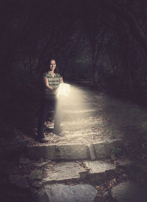
Here’s a look at Kevin’s work ‘Book of Light’:
As always, I’m going to be focusing on what I’d improve with each work.
That being said, this work is awesome! I love the concept, it’s incredibly creative. The colors have a very soft, almost pastel feeling to them which works very well, giving a somewhat magical feel. The blending is spot on, and considering that the woman was photographed in a studio setting the cohesion of the final piece is particularly impressive.
Let’s look at what may be able to be improved though…
Suggestion 1: More Shadow, Focus the Light Source
I know that you’re trying to expose some of the detail and beauty of the scenery, but I found that the extraneous light in this piece was a little distracting.
The main light source is clearly emitting from the book, but the area behind the woman, and a patch of trees in the far background are also lit up.
With no clear light source for these areas they feel a little unnatural. Beyond this, I like the idea of the book guiding the woman through a dark forest, so it would be great to have the forest behind her swallowed up in darkness.
Suggestion 2: Pay Attention to Details
You’d have to play around with what was realistic given the lighting of this piece, but I’d love to tie together the woman and her surroundings a little more, to make the piece come together.
I think it could be interesting when in the studio setting to cast branch shaped shadows over parts of the woman, as if the trees surrounding her in the final piece are looming down upon her, and casting their shadows on her.
Suggestion 3: Play With the Magical Element
The concept of a magical light emitting book is a strong one. Whilst the scene feels very realistic, I’d like to see you play with the magical element a little more.
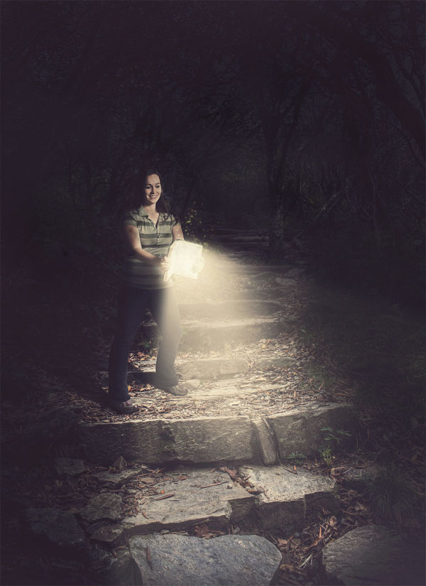
In my example I’ll show in a minute I’ve added some simple light effects to show specks of light rising up from the book. This just helps make the piece even more awe-inspiring.
If this feels too much though you could play with all kinds of subtle magical additions, such as vague silhouettes of creatures following the woman in the trees.
Suggestion 4: Improve Your Character
As you’re shooting the woman in a studio setting I think you can work on her a lot. Your blending of her photo is perfect, but there’s so much more you could achieve. This would be my main suggestion.
Firstly, she hints at a studio origin through her facial expression, which seems bemused at holding up a book in an unnatural position. I would encourage a little acting on the part of your model and have her gasping with shock and awe. This would give a much stronger emotional aspect to your final piece. She should of course have her eyes on the book or the light beaming out of it.
You could go one step further and give her a cool costume. The sneakers/jeans look isn’t really fitting with the overall scene/concept for me. If you think light red riding hood style and use an appropriate old-time costume, coupled with the awed facial expression I think it would transform your piece.
Overall Analysis:
Overall it’s a fantastic piece and a great concept. I think you could take it to the next level though. By refining your light source, using a more believable character/pose and adding some finer details throughout the piece you’d be onto a world-class work of digital art.
Here’s a slight adaption I worked on. Please bear in mind this is literally 2 minutes tweaking your image. To properly use my suggestions you’d need to reshoot your model and place with the source file for this piece:
Dreamscape by Su Hall
I’m so happy that Su has joined us on this series. Su is one of our long-time members and a great part of all our community efforts.
I hope my analysis helps you Su .
Here’s a look at Su’s piece ‘Dreamscape’:
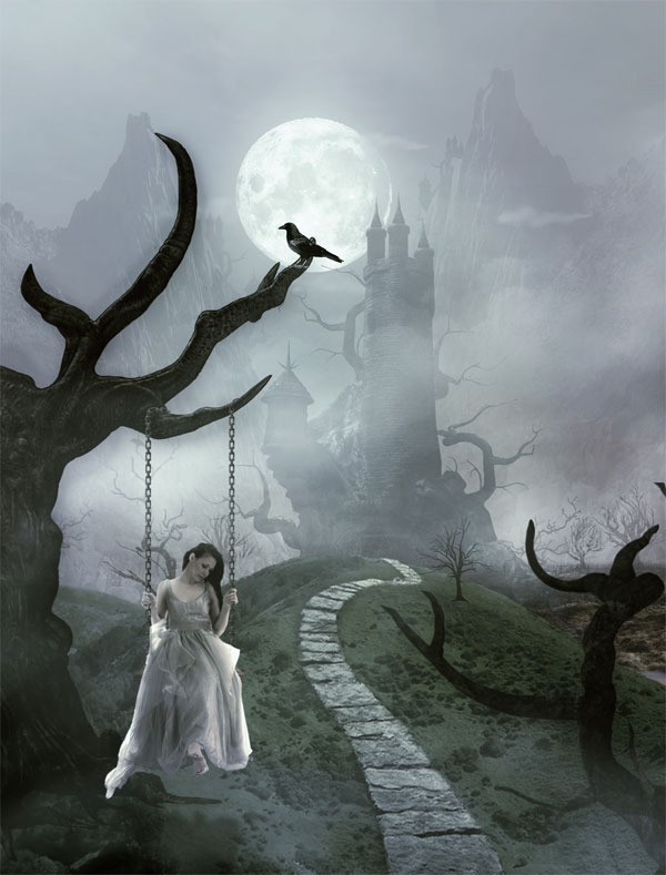
This is a particularly interesting example, as Su’s piece is based off of our own Emotional Dreamscape tutorial. You can download the .psd source file for this tutorial here:
Emotional Dreamscape Source File (FanExtra Members Only)
You can view the original tutorial at PSDFAN here

Suggestion 1: Identify a Light Source
Your piece is really great and shows off your unique style really well. As a piece of art I don’t think there’s anything wrong with it. However, it does show influence from your scrapbooking side, as it feels a little more like a collage than a work of digital art in some ways.
Overall the piece does feel quite flat, which in my opinion works for this style. However, if you’re looking to achieve a look more like the original tutorial outcome your piece is based on, then you must identify a light source.
The main light source in this piece has to be the bright moon. With this in mind, try to work out what parts of your image will be hit by the light of the moon and apply highlights where they are relevant. Similarly, use this light source to identify what areas of your piece will be in more shadow.
Using a common light source will bring the various elements of your piece together, and stop it looking flat.
You mentioned that the woman wasn’t really fitting in for you. I think the main issue with her is lighting. Her dress has some pretty strong highlights on the sides, implying a strong front/side light. This doesn’t fit with the primary moon light source, and makes the woman stand out as isolated and somewhat stuck on.
Suggestion 2: Use More Color
A big difference from your piece and the original tutorial outcome is the amount of color used.
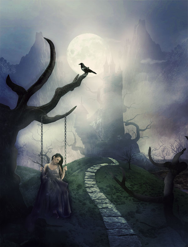
Your piece is more desaturated and washed out than the original image. This is another contributing factor to it’s flat appearance.
By adding more saturated colors to your piece you’ll be creating more natural looking surfaces, and be creating more contrast between various elements. This will help to create depth in your work as the eye is drawn naturally up the green hill to the castle/sky.
I would also recommend not just increasing the general saturation of your piece, but applying some adjustment layers. By adding gradient overlay, color overlay and curve adjustment layers over your final piece you can bring all the elements together into one cohesive scene, but creating a unified color palette for the image.
Overall Feedback:
I’m hugely impressed by your piece. Particularly the mountainous backdrop is absolutely stunning. This is different than the stock used in the original tutorial and I think it looks incredible.
I think as a collage/scrapbooking style piece your work is fantastic. If you’re looking to make it look a little more ‘digital art’ and give it some more depth and realism I would advise using a clear light source, and adding some more color/contrast to the piece.
Here’s my outcome after a few minutes playing around in Photoshop. Again, it’s very rough, but I hope it illustrates some of my points for you:
Comment to Get Free Feedback on Your Work
If you could like feedback on any of your designs, whether finished or not then post a link to the image in the comments to this post.
I will personally critique each and every suggestion that I receive this time next week.
Look out for the next installment of the series, and I hope that you’ll get involved.
 Artist Breakdown #5. Edmar Cisneros: Herald (Source File Available)
 Design a Sleek Google+ Icon (Plus Free Google+ Icon Set Download)

Tom, you are marvelous! I see exactly what you are referring to in my piece! That is what it needs – light source refinement and color. I didn’t realize I had it so washed out until I saw them in close proximity. Wow!
I am often fearful that I will overdo a shadow or a highlight. You saw that I use a greyscale layer to burn and dodge on, so, I can always reduce the opacity or whatever. On the girl’s skirt, I was afraid to darken it more, for fear of losing detail. But, in reality, some areas’ details are lost due to shadow. Doh! You’re so right about the collage/scrapping influence. In those, I would want all areas equally exposed. In natural settings, they just aren’t!
What an eye opener! I could not put my finger on what it lacked. Seeing your ‘edit’ version, well, it makes it kind of obvious to me! Thank you! You don’t know how much this has helped!
Su
So happy to help Su . As I mentioned, I think your original piece was great, and it’s definitely not a bad thing to go with your own personal style.
I hope you’ll post your next version for everyone to enjoy too though.
I’d love to review any other works you would like help with. Feel free to suggest them here .
.
Tom,
Thanks for taking the time to review my work! I appreciate all of the thought you put into your critique.
I liked the detail that you can see in the shadow, but you are right about the contradiction. There is no light source hitting the background, and therefore it should be pitch black. I think the model’s face is also lit up incorrectly, because the light source probably wouldn’t hit her face.
I do like the idea of adding a magical element. I have made several images with glowing lights and orbs, and they add a fantasy-theme to the image. In this specific image, the book is a Bible, so I was hesitate about the “magical” idea. But I can always transform this Christian artwork into a Fantasy artwork with little effort.
And as for the model’s clothing, that was a result of poor planning. I shot her in studio with no idea of what background to use. I just knew the book would be glowing, so I made sure the light source was completely in front of her. I think a costume change would add a lot more value to this image. I do like the casualness of a shirt and jeans, but it limits the picture.
Thanks again for all of your input! I appreciate the feedback, and I’ll be using your tips for when I try to re-do this shoot.
No problem Kevin, it was a really great piece to analyze.
I would advise that you can’t assume what the audience know. It wasn’t clear to me (and wouldn’t be to anyone else) that the book was a Bible.
I think the clothes would make a massive difference, but honestly I think the facial expression would have even more impact.
I really hope that you’ll post your next version here as I’d love to see it.
Really great pieces and some good critiques to go along with them. I agreed with many of the points and think it is always helpful to have a peer or someone in the creative community who you trust take a look at your work to give you some good honest feedback. Often times we have been staring at an image for so long we start to lose sight of the other possibilities. One thing that I would like to add to the second piece is something I have been noticing with many of the digital art pieces out there is that there is a tendency to make the moon so huge that it totally dominates the background. I think the moon can definitely be leveraged to help you produce a stronger light source but in terms of scale I think making it a bit smaller would also help with the realism. Great job overall on both of these!
Thanks Eric! For the second piece I think it is more of a fantasy composition, but I do agree about the majority of more ‘realistic’ digital art over-scaling the moon. I appreciate the feedback like always .
.