
Create A Mixed Media Piece From A Hand Drawn Illustration In Photoshop
In this tutorial I will be showing you how to create design that combines traditional drawing with Photoshop. We will use a hand drawn illustration to develop a more complex piece with some of the basic Photoshop brushes and painting techniques. It’s a great way to create something that is both unique and fun while experimenting with a variety of techniques.
Resources Used In This Tutorial
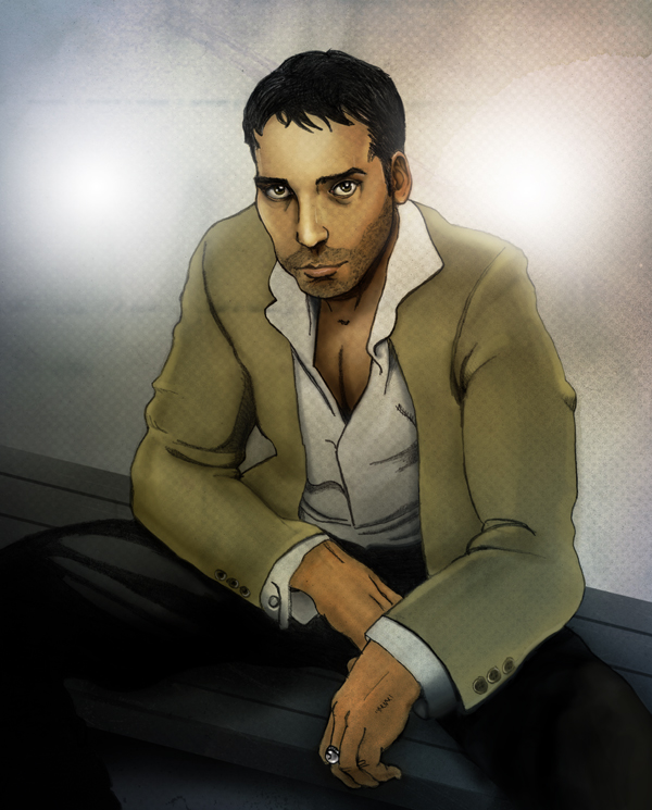
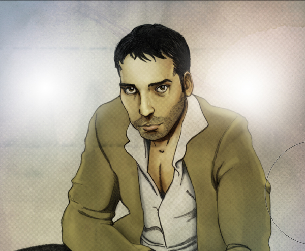
Final Image
Here is a preview of the image that we are going to be creating in this tutorial:
Step 1
The first thing we want to do is open up the “Sketch” PSD file from the resources folder. Once you have the file open you will see that there is only one layer at the moment and it’s position is locked – See the small icon highlighted in the Layers Palette here:
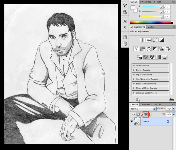
When this is on, your layer is locked in place; also indicated by the small lock icon that appears on your layer.
I have already made a couple of the necessary adjustments to the sketch beforehand to clean things up a bit and also just to crop the image.
Step 2
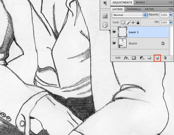
Next, add a new layer just above the sketch layer as shown below:
Select your Paint Bucket Tool (G) and fill your new layer with solid black. From here, press the “2” key on your Keyboard to bring the opacity down to 20% and change the Blending Mode to Overlay.

Step 3
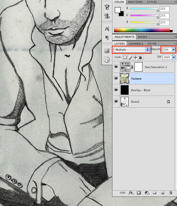
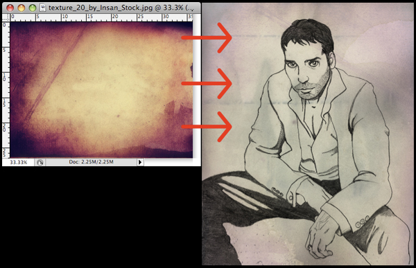
Open the first grunge paper texture from the resources folder and drag it into your document and change the Blending Mode to Multiply. Use the image below as a guide for positioning the texture.

With your “Texture” layer highlighted, click the Adjustment Layer Icon along the bottom of your Layers Palette. From the menu that appears, choose “Hue/Saturation” as shown here:

As for the settings, change the Hue to +14 and the Saturation to about -52.

Once you have done that, reduce the opacity of the texture image to 50%.
Step 4
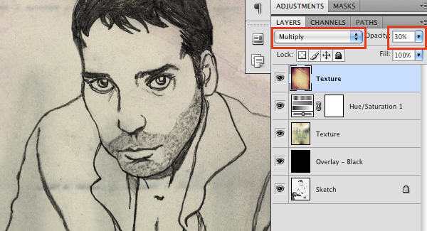
Next, open the second texture from the resources folder and then proceed to drag it over into your working document and place it at the top of the layer stack.
Here I have quickly done a Free Transform (Command/Ctrl + T) to rotate the image 90 degrees clockwise. Feel free to play around with the positioning of the layer until you find something you like.
Change the Blending Mode of the texture to Multiply and then reduce the opacity of the layer to 30% by either dragging the opacity slider or simply tapping the number “3” on your keyboard while the layer is selected.
Step 5
Create a new layer just above your “Sketch” layer at the bottom of the Layers Palette.

Press the “D” on your keyboard to revert to the default black and white colors. From here, switch to your Gradient Tool (G) and select a Linear Gradient that fades from black to white as shown below:

Click at the top left of your image and drag down and across to the bottom right corner of your canvas to create the gradient on your layer.

Step 6
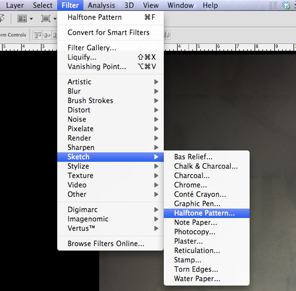
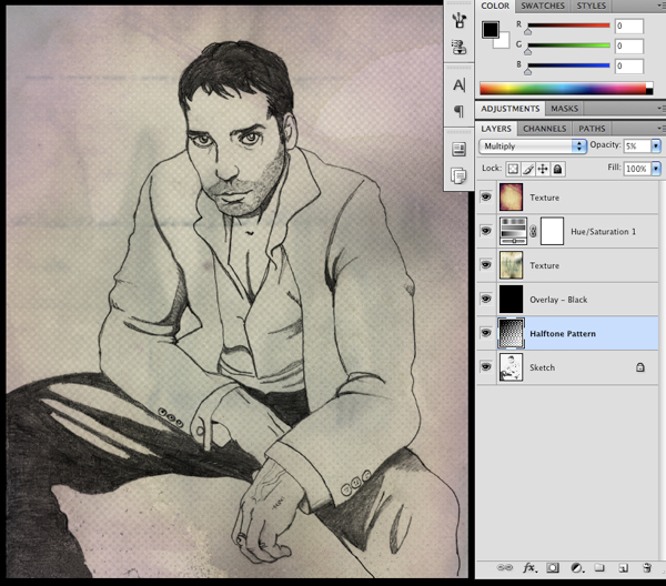
Go to the Filter Menu and choose Sketch > Halftone Pattern as seen below:
For the settings, use 2 for the Size and about 40 for the Contrast.

After you apply the settings, change the Blending Mode of the Halftone Pattern Layer to Multiply.

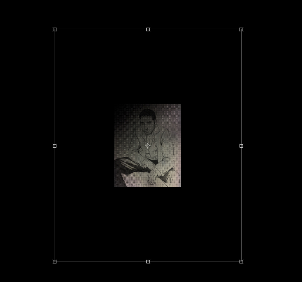
Press Command/Ctrl + T to initiate a Free Transform Command and while holding down both the Alt and Shift Keys on your keyboard, drag outwards from any of the four corners of the image to scale it up in size.
The last step here is to reduce the opacity of the pattern to somewhere around 5-10% in order to create a more subtle effect.
Step 7
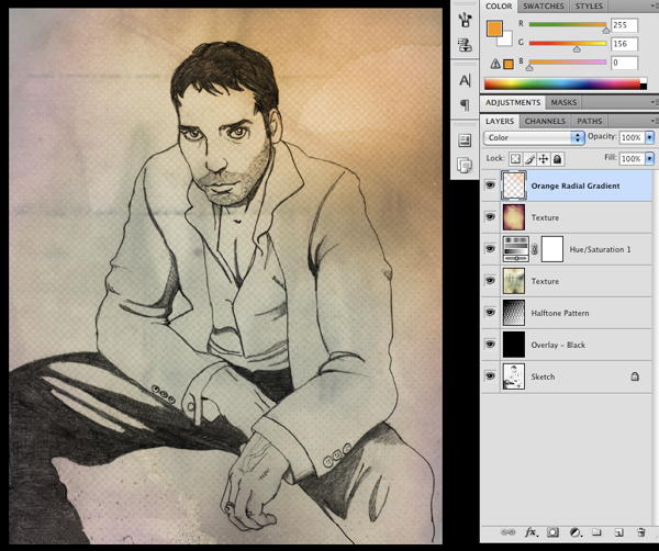
Create a new layer at the top of your Layers Palette and select a vibrant orange color like #FF9C00 as shown here:

Next, switch to your Gradient Tool (G) and this time select a Radial Gradient that fades from solid orange to transparent.

With your settings ready, click and drag your mouse outwards from the center of the image to create your Radial Gradient. Change the Blending Mode of the layer to Color and then place it in the upper right corner of the image.

Lower the opacity of the layer to about 40-50% and you should end up with something like this:
Step 8
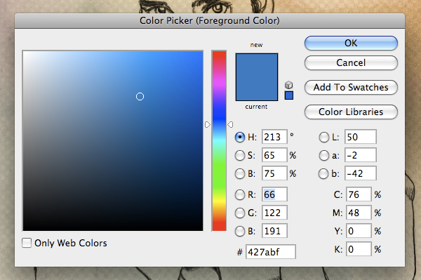
Create another new layer at the top of your palette and then switch to a medium blue color such as #427ABF as shown in the image below:
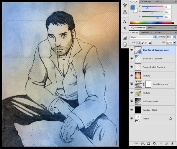
Using the same Radial Gradient as before, we will click and drag outwards on our canvas to create a blue gradient. Once you have done that, change the Blending Mode of the layer to Color.

Step 9
With your Blue Radial Gradient Layer highlighted, reduce the opacity to about 70%. From there, press Command/Ctr + J to duplicate the layer and move the copy to the opposite corner of your image.
Select your Orange Radial Gradient Layer and then proceed to make a duplicate of this layer by once again pressing Command/Ctrl + J. Move this copy to the bottom left corner of the canvas.

Select the top gradient layer in your palette and then while holding down the Shift Key, click on the bottom-most gradient layer so that you have them all highlighted together.

While all of your layers are selected, press Command/Ctrl + G to place them into a Group Folder. After doing that, give your folder a name so that it’s easy to spot. I have chosen to name it “Color Gradients” just to keep things simple.
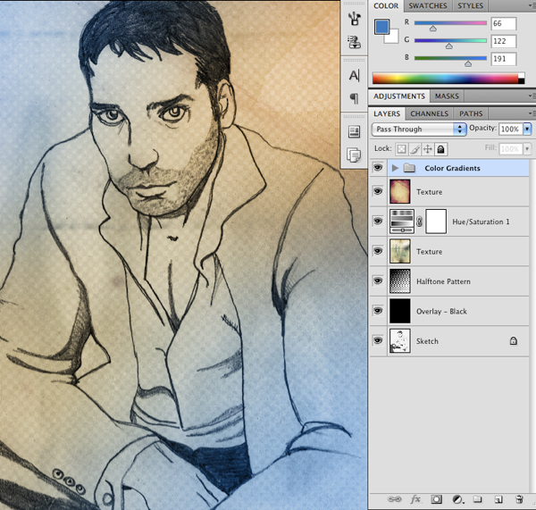
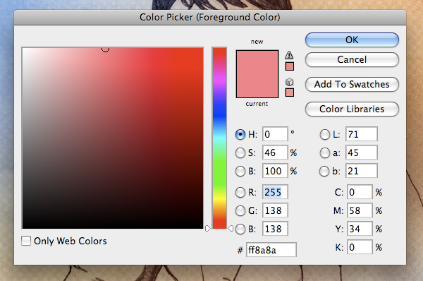
Step 10
Make a new layer at the top of your Group Folder and select a red/rose color such as #FF8A8A.
Create another Radial Gradient and change the Blending Mode of this layer to Soft Light. Feel free to experiment with the placement here, but I find that the best result is somewhere in the middle of our composition. I have also reduced the opacity of the layer just down to 80%.

Select the Group Folder containing all of our color layers and reduce the opacity of the group to 30-40%.
We have built up some nice colors and textures in our background while still being able to see our illustration nicely. From here we can start doing some painting and adding in more detail.
Step 11
Select your “Sketch” layer and change the Blending Mode to Multiply before moving on.

Add a new layer and place this one at the bottom of your palette, just below the line art.

Step 12
On your new layer, switch to your Brush Tool (B) and select the color #FFD594.

For your brush settings, you can use a small round brush as shown here:

Fill in all of the skin with this brush to lay down some mid-tone values. At this point you don’t need to worry about being super neat. Once you have filled in all of the areas of the skin, click on the Layer Mask Icon at the bottom of your Layers Palette as indicated in the image below:

Use a solid black brush and with your mask selected, paint into your image to go over the parts of the skin that are outside of the lines to clean up your edges.

Step 13
Create a new layer above the mid-tones layer and select a vibrant blue color (here I am using #2A68F7).

Use the same brush to fill in the jacket just like we did with the skin in the previous step. Once you have filled the whole area with color, proceed to add a Layer Mask by clicking the icon shown below:

Make sure that you have a solid black color selected when painting into your mask and cleaning up the edges of the jacket.

With your jacket layer selected, press Command/Ctrl + Alt/Option + U to bring up the Hue/Saturation Adjustment. Modify the settings as shown below to change the color of the layer.

Step 14
On a new layer below the sketch layer, select a light gray color and fill in the pants using the same method as in the previous steps. Once you have cleaned up your edges, switch to a soft round brush at a low opacity as shown here:

Using a slightly darker gray than your original color, brush in some shadows in the darker areas of the pants. By using a soft brush at a low opacity we can gradually build up our shadows with smoother edges.

After just a few minutes you can begin to establish some nice values throughout the pants and we almost have the base colors completed.

Step 15
Create a new layer at the top of your palette and switch to your Brush Tool (B). Choose a lighter shade of the jacket color (here I am using #B7A95E).

For your settings, use a soft round brush at a low opacity (about 10-15%) as shown in the image below:

Begin to paint along some of the edges of the jacket to paint in some highlights. Again, by using a soft, low opacity brush we can create smoother transitions when trying to blend our colors.

After spending a few minutes working on the jacket you can see that we have started to bring in some nice highlights that add variation and start to make the image feel more realistic.

Step 16
Create a new layer at the top of your Layers Palette and change the Blending Mode to Multiply. Switch to your Brush Tool (B) and select a 20 pixel soft round brush at 20% opacity as shown here:

Select a darker, saturated brown color such as #5B3E24.

What we want to do next is brush around the eyes, sides of the face, under the chin, and all of the recessed areas where shadows would fall.

Do the same to the hands by painting in some shadows along the bottoms and edges of the hands as shown below:

Step 17
We will now choose a different color (#BB8D5B) and create another layer set to Multiply on top of our previous layer.

Paint over the shaded areas and begin to blend the lighter and darker colors with your brush.

You can continue painting on this layer or create a new one above it as we want to warm up some of the skin color by introducing a bit of red. Now, we don’t need to literally paint a red color into our piece – we will instead use a color that just looks reddish because of the other colors already on our canvas.

Still using your low opacity brush, paint around the cheeks and forehead, as well as the chest and hands. We don’t want the skin to look totally flat and lifeless here, so doing this should help bring some more life into it.

Step 18
Create a new layer and select your Brush Tool (B) if it isn’t already selected and then grab a hazel color such as #6C6134.

With a small hard round brush, fill in the pupils of the eye with your color.

Select a darker shade of this color (I am using #28210A).

With a soft, low opacity brush, paint in some darker areas of the pupils as seen here:

Select a middle gray color (#8C8C8C) and paint in some shadows in the eyes – remember that the eyes are like spheres and there are shadows cast on them from different angles.

The eyes should never be solid white and we want to give the impression that the eyelids wrap around the sphere of the eye. Use some of the lighter colors of the eyes to add more details as you work.

Step 19
Continue to work on and around the eyes by sampling colors from the image. An easy way to do this is to hold down the Alt/Option Key while your Brush Tool is selected to toggle between the brush and the eyedropper.

Next, switch to a solid white color and create a new layer with the Blending Mode set to Overlay. Start to brush over certain areas of the face that we want to come forward (i.e. the highlights) such as on the forehead and nose area. You should use a soft low opacity brush for this so you can gradually build up the effect on the skin.

Step 20
Create another new layer with the Blending Mode set to Multiply and choose a darker shade of the jacket (I am using #696440) as shown below:

With a soft round brush, paint over some of the folds and creases of the jacket to add some depth. Feel free to experiment with either the opacity of your brush or the layer itself in order to create a more natural looking blend.

Step 21
Make a new layer at the top of the layer stack and select a soft round low opacity brush. With your Brush Tool (B) selected, choose a blue-gray color such as #818388 as show in the image below:

Change the Blending Mode of your layer to Multiply and then begin to paint over the beard area to slightly darken the facial hair. Generally the face usually will have some tint of blue in the lower third of the face, more noticeably on a man.

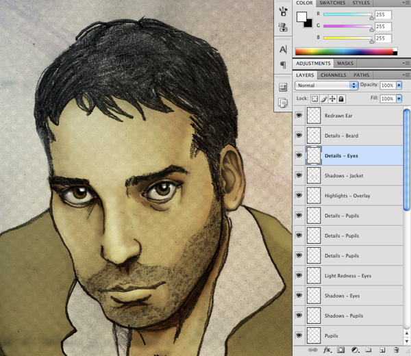
Step 22
At this point I am just looking over the drawing and want to clean up a few spots starting with the ear. All I have done here is create a new layer and then I’ve sampled some colors from the surrounding skin-tones to paint over the ear, just using the illustrating as a rough guide.

After spending a few minutes on this area I think it is a nice improvement so I will make sure to save my work before moving on.
Step 23
Create a new layer above the “Redrawn Ear” layer at the top of your palette and select your Brush Tool (B). Press the F5 Key on your keyboard to bring up the Brush Menu. Once the dialog box appears, check off “Shape Dynamics” as well as “Scattering” from the menu.
For the Shape Dynamics, use the settings shown here:

Next, use the image below to change your Scatter settings.

Using a small white brush and the options we have just set, paint in some white highlights onto the eyes.

Next, go to the Filter Menu and choose Blur > Gaussian Blur as shown below:

When the Blur Options appear, set it to a radius of about 0.4 pixels.
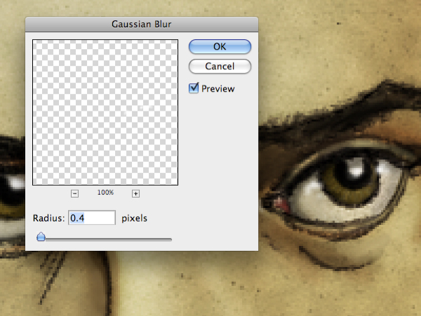
This is a good way to add just a bit of a strong highlight to show the reflective and wet quality of the eye. Let’s take a look at where we’re at with our work:
Step 24
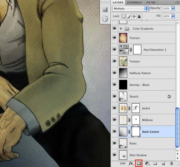
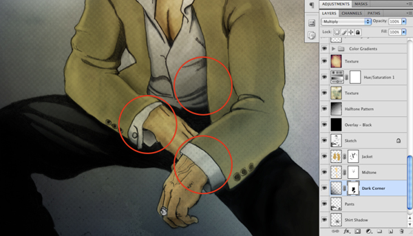
Create a new layer and with a low opacity black brush, begin to paint over the pants so that it gradually fades to black on both legs. You may also wish to go over the other shaded areas on the lap and under the arms just to make things look a bit smoother. This will help to cover up some of the pencil marks as well.

Using the same soft brush, create a new layer and fill in some of the shadows on the shirt – pay attention to the insides of the sleeves and the shadow cast onto the shirt by the jacket.

Step 25
Next, create a new layer and select a small hard round brush with a solid black fill. Begin to make some lines over the hair in different directions to fill in this area. We want to keep the lines somewhat free flowing while going along with the direction of the hair.

Create another new layer and with a solid white fill, draw in a few lines to add some small but sharp highlights on and around the face. The image below shows a few areas where you may wish to do this:

Step 26
Create a new layer at the top of your palette and with your Brush Tool (B) still selected, grab a pale pink color such as #AB6077 as seen below:

Paint over the lip area to fill it with color and then change the Blending Mode of the layer to Multiply. Feel free to experiment with the opacity here, but we don’t want the color to be overly saturated so I’m leaving mine around 40%.

Step 27
Switch to a large soft round brush at about 20% opacity.

On a new layer, create two large dots with your brush on both sides of the head to add some lights. Conversely, you could do this with the Radial Gradient Tool (G). The idea is to create two point lighting from both sides which works kind of nicely here.
Step 28
Select a deep blue color such as #14222A as shown below:

Switch to your Linear Gradient Tool (G) and make sure you gradient fades from the dark blue to completely transparent.

Click and drag your mouse from the bottom left corner, up towards the right corner to make your gradient.

The next thing we want to do is add a Layer Mask to the gradient by clicking the icon highlighted below:
With a solid black brush selected, brush out the areas indicated below so as not to show any of the blue color on the shirt.
Step 29
Create a new layer just below the dark gradient from the previous step. Switch to your Marquee Tool (M) and create a rectangular selection across the bottom of the image as shown below:

Use the Paint Bucket Tool (G) to fill your selection with a solid black color.

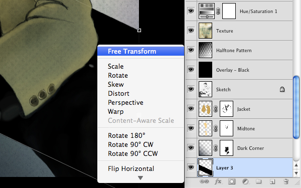
Press Command/Ctrl + T to initiate a Free Transform and then, hold down the Control Key and click on your rectangle. Doing this will reveal a dropdown menu where you want to select “Distort” as seen here:

Distort the shape so that it goes at an angle similar to what I have done here:

You may have to return to your transform menu and try doing a regular Free Transform to widen the shape so that it sits at a good angle. The idea is that we want to have a bench of some kind below the man and this shape will serve as the base.
Step 30
Once you are happy with the angle of the shape, add a Layer Mask by clicking the icon at the bottom of your Layers Palette:

Use a solid black brush to brush out he areas on the shirt as shown below:

Step 31
Create another rectangle shape on another new layer – this time it should be a shorter version of the previous shape.

Fill the layer and transform it again to create the front of the bench. Rather than using a solid black, we want to double click the layer to bring up the Layer Styles Dialog Box. Check off the option that says “Color Overlay.”

For the fill color, we will be using a dark gray such as #464646.

Once you have done that press the Enter Key to apply the changes.
Step 32
Create a new layer above both of your bench shape layers and switch to your Gradient Tool (G). Make sure that you have a Linear Gradient selected that fades from a solid white color to completely transparent.

Hold down the Command Key and click on the Layer Thumbnail Icon of the main bench shape layer to activate a selection around the shape. You should then see the marching ants going around the shape to indicate your selection.
With your Gradient Tool (G), click and drag down and to the left to create a gradient inside of the bench shape.

Next, switch to your Brush Tool (B) and make sure you have a low opacity soft round brush selected. Create another new layer and paint in some shadows above the bench layers as well as some shadows beneath the bench to give the bench some form.

Now our subject is grounded and doesn’t look as though he is floating in space. It also gives the character some weight while at the same time making the composition more interesting and realistic.
Step 33
From here we want to bring in some more contrast and saturated colors to make the piece pop a bit more. In the image below I have added some slightly darker shadows to the jacket in the folds.

Step 34
Next, create a new layer set to Color Burn and switch to your Brush Tool (B) if it isn’t already selected. Choose a medium brown color such as #9E7847.

On your new layer, use a low opacity brush to paint over the skin on the face, chest, and hands. This should help bring more of a saturated tone into the skin.

This step is similarly referred to as a “wash” or a “glaze” in painting where we are adding some colors at a low opacity that allows us to maintain the tonal variations and integrity of the piece while making it more realistic and warm.
Step 35
If you notice the way that the head is leaning forward there should actually be more of a shadow underneath than what we currently have here:

Using a soft round brush, select a dark brownish color with the Eyedropper Tool (I) and then painting on a new layer set to Multiply onto the neck and chest area. The image below shows the result:

By looking at both of the images above you can see the difference in the contrast of the shadows. This is important for achieving balance and realism in our piece. Continue bringing in some more contrast by darkening some of the shadows a bit more until everything is feeling balanced.
Step 36
Feel free to experiment with the colors and the values of the piece further if you feel the need. At this point we are looking good and I wanted to take a moment to see where we started:

And after following along with this tutorial, hopefully you will end up with something like this:
I hope you have learned something from this design tutorial and as always, thank you for following along! Happy Photoshopping.
Member File Download
Download the original .psd file for this tutorial here:

 Members Area Tutorial: Create a Mixed Media Effect in Photoshop
 Members Area Tutorial: Create A Glamorous Digital Illustration With Photoshop
 Members Area Tutorial: How to Create a Graphics Tablet in Photoshop

Leave a comment
0 Comments:
No comments have been posted yet. Be the first!
Leave a Comment: