
Members Area Tutorial: Design a Multi-Page Portfolio Website
Resources Used In This Tutorial
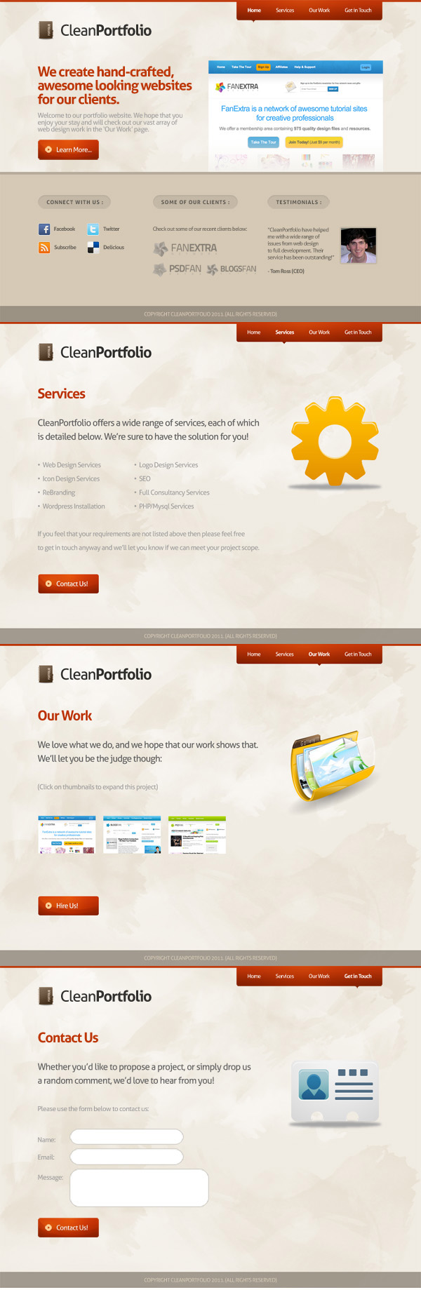
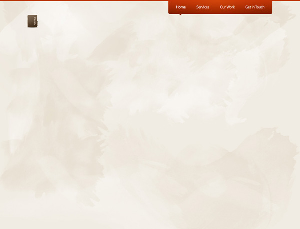
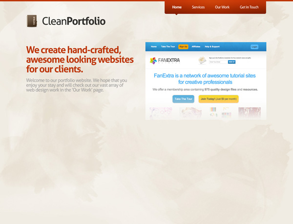
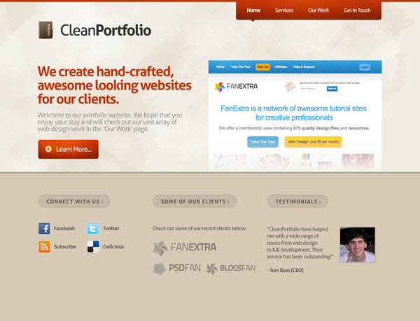
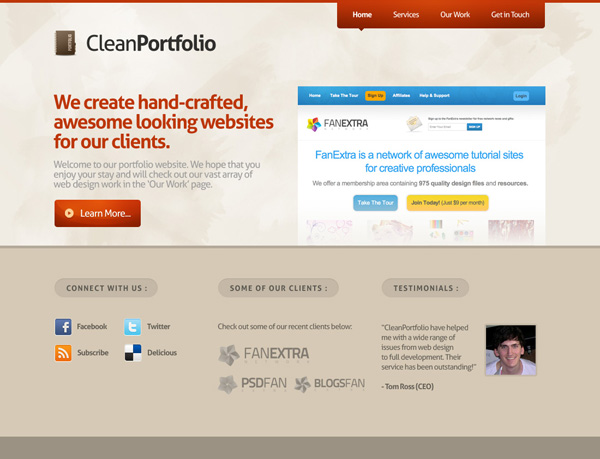
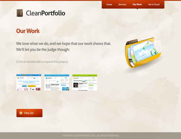
Final Image
Here is a preview of the image that we are going to be creating:
Step 1
Create a new document (1100X840px).
Create a new layer called ‘background’ and fill your entire canvas with f0ebe2.

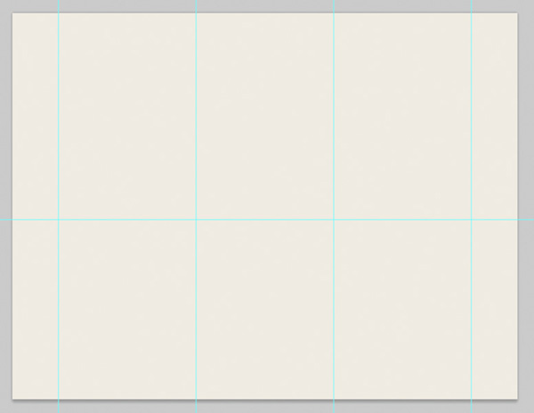
Step 2
Now set out some canvas guides to help structure your layout. These guides will help when we later move onto creating the subpages for this website.
Create the following guides:
Vertical Guides:
100px, 400px, 700px, 1000px
Horizontal Guides:
450px
Step 3
Now download the FanExtra Watercolor Brush Set from this members area.
Create a new layer called ‘watercolor dark’. Apply several of the brushes over your canvas, using a black paintbrush.
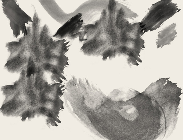
Now reduce this layer’s opacity to 70% and change it’s blend mode to ‘overlay’.

Now create a new layer called ‘watercolor light’. Repeat this technique, using a white paintbrush. Reduce this layer’s opacity to around 50%.

Now create a new layer called ‘highlight behind logo’. Drag out a radial gradient (white to transparent) in the top left of your canvas. This will help to highlight your logo area later.

Now reduce this layer’s opacity to 50%

Step 4
Select the top 5px of your canvas and create a new layer called ‘top bar’.
Fill your selection with bd3608.

Now create a rounded rectangle (5px radius). Fill this rounded rectangle with a gradient overlay ranging from bd3608 to 7e2100. Rasterize this layer, and then merge it down with your ‘top bar’ layer.

We want to draw some more attention to this menu area, so create a new layer called ‘menu highlight’. In your layer palette option+click on your merged ‘top bar’ layer in order to select your entire menu shape. With this selection in place, return to your ‘menu highlight’ layer. Drag out a radial gradient (white to transparent) from the top center of your menu area.
Now reduce this layer’s opacity to 30% and change it’s blend mode to ‘overlay’. This creates a subtle highlight effect.

Now apply some text over your menu. Be sure to use regular styling for your non-active links, and bold to display which link is active.
Menu Font Settings:
Font Face: Aller
Size: 14pt
Color: ffffff
Kerning: -50
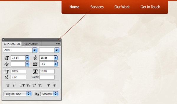
To further denote which page is active, creating a new layer called ‘menu active state’. Use your lasso tool and paintbucket tool to create a small arrow shape beneath your active menu item. Fill this arrow with 7e2000 so that it blends in nicely with the bottom of your menu.

Step 5
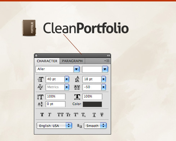
Now it’s time to create our logo area. Start by pasting in the ‘portfolio logo icon’ from the resources section for this tutorial.
Now type out some logo text.
Logo Text Settings:
Font Face: Aller
Size: 40pt
Kerning: -50
Color: 31302f
Step 6
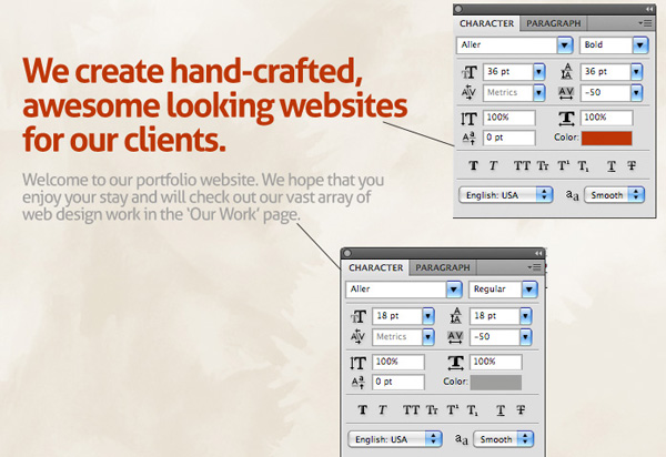
Now apply some text beneath your logo. This will act as your welcome area.
Main Welcome Heading Text Settings:
Font Face: Aller
Size: 36pt
Kerning: -50
Color: bd3607
Smaller Welcome Area Text Settings:
Font Face: Aller
Size: 18pt
Kerning: -50
Color: 9f9e9d
Now paste in an image of one of your best recent designs. I’ve gone with my recent design for the new FanExtra, which of course you’re looking at right now! ![]()
Resize and position this image so that it fits nicely to the right of your welcome text area:
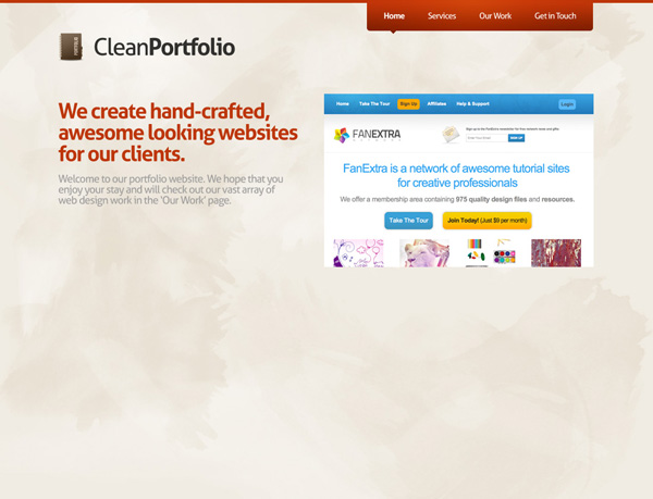
Now create a new layer called ‘thumbnail fade up’. Select the bottom of your design image and drag up a f0ebe2 to transparent linear gradient. This should make it look like your featured design is slightly fading into your main background.
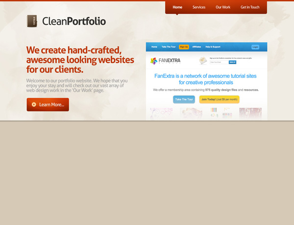
Now it’s time to create a nice looking call to action button beneath our welcome text.
Start by dragging out a rounded rectangle shape (5px radius). Then apply a gradient overlay to this layer. Your gradient overlay should range from 7d2000 to c13709.

Create a new layer called ‘button circle 1′. Drag out a circular selection over your button, and drag up a white to transparent linear gradient. Then deselect.
In your layers palette option+click on your button layer to select it, and then go to select>inverse. Hit delete and this should delete the areas of your gradient arc you’ve just created that go beyond the edges of your button.

Reduce your circle layer’s opacity to 15%, and change it’s blend mode to ‘overlay’. This creates a subtle light effect within your button. Now duplicate your circle layer (increasing the duplicate layer’s opacity to 25%) and move the duplicate upwards, duplicating the light effect:

Now add in a subtle button highlight (the same way you added your highlight to the menu). Also paste in the arrow icon from the resources section to this tutorial (giving it a subtle yellow overlay):

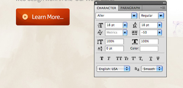
To finish up your call to action button add some text.
Learn More Button Settings:
Font Face: Aller
Size: 18pt
Kerning: -50
Color: ffffff
Now place all layers associated with your call to action button in a layer folder called ‘button’.
Step 7
Create a new layer called ‘bottom area’.
Using your guides select the bottom half of your design and fill it with d6c9b5.
Then create a new layer called ‘bar underneath’. Select the 5px between the top and bottom parts of your design and fill this with b5aa9a.
Step 8
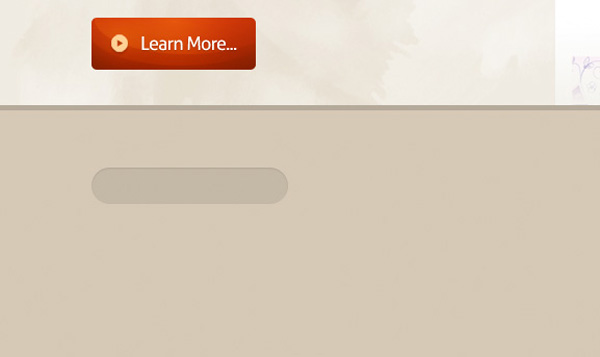
Now using your guides create a rounded rectangle (20px radius) at the top left, of this new bottom area. Fill it with whatever color you want (I’ve used white):
Now apply an inner shadow and color overlay blending option to this layer.
Color Overlay Blending Option Settings:
Blend Mode: Normal
Color: c4b8a6
Opacity: 100%
Inner Shadow Blending Option Settings:
Blend Mode: Multiply
Color: 000000
Opacity: 10%
Angle: 90
Distance: 1px
Choke: 0%
Size: 1px
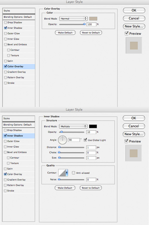
You can see the result of this below:
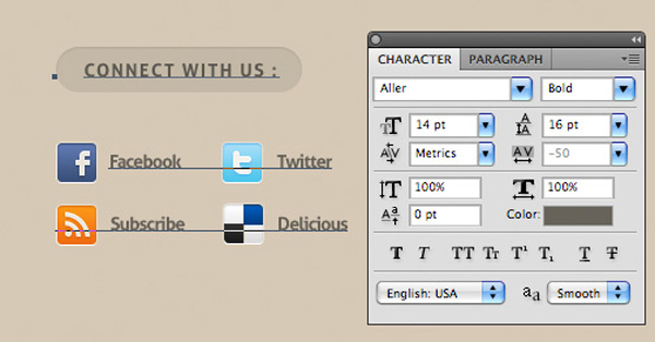
Now paste in some social networking icons beneath this headnig area, and type out a heading and other text.
Text Settings:
Font Face: Aller
Size: 14pt
Kerning: -50
Color: 666259
Step 9
Now group your ‘connect with us’ text layer, the social icons layers and the rounded header area layer into a layer group called ‘bottom area 1′. Then duplicate this layer group twice, moving each duplicate according to your layout guides, until you have a nice 3 column bottom area to your design.
Then mix up the content in each column, whilst keeping the same font settings.
For the second column I used some faded client logos to show recent clients, whilst for the third column I added a simple testimonial area.
Step 10
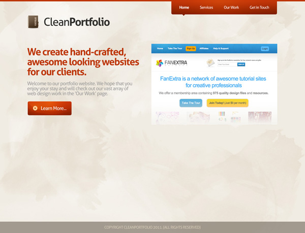
Now create a new layer called ‘footer’. Fill the bottom 40px of your design with 9b9183.
Now apply some copyright text to your footer:
Font Face: Aller
Size: 14pt
Kerning: -50
Color: d6c9b5

Step 11
Now before we move onto the subpages for this design, it’s very important to group your layers correctly, as this will make the process much easier!
Try to break your layout into sections, and put all layers associated with each section into a specific layer group. You can see that I’ve done this below:
Step 12
Now… time to create some subpages! This is the easiest way I know of to create subpages that use the same basic layout (same header/menu etc…). Rather than duplicating a load of content from your homepage design, simply resave your document under a new name (so this file will act as your subpage file).
Then begin removing areas of your layout that aren’t needed for a subpage. This is made easier as after the last step we have each area of our layout confined to a layer folder.
It’s always best to simply hide a layer folder rather than deleting it. This way if you need it back at any point you can simply switch it’s visibility back on.
Start by hiding your ‘bottom area’ layer folder:
Step 13
Now it’s literally a case of changing the remaining content!
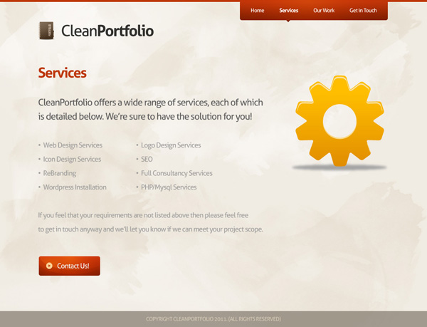
Start by removing the image of your featured design and replacing it with the large cog icon found in the resources for this tutorial:
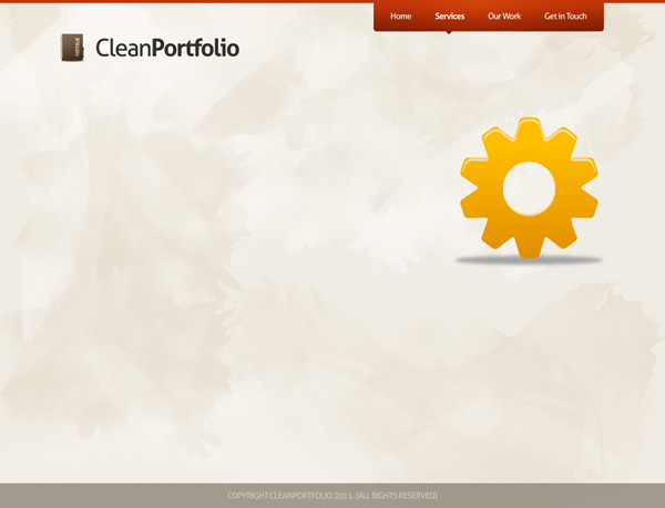
Now simply replace the old text with new text, but using the exact same formatting. You won’t need to restyle any text as it’s already looking right. Change the ‘learn more’ text in the call to action button to ‘contact us’, as this new call to action button should encourage people to hire you:
You’ll notice too that I’ve changed the active menu item. To do this simply move along the ‘menu active item’ layer containing your menu arrow, and make sure it sits underneath the active item. Then make your ‘Home’ text regular, not bold, and make the correct page’s menu item text bold:

Step 14
Now that you have your basic subpage template it’s even easier to create further subpages.
To create a new subpage repeat the process again. Remain in this document, and rather than creating a new document, simply save this document under a new file name.
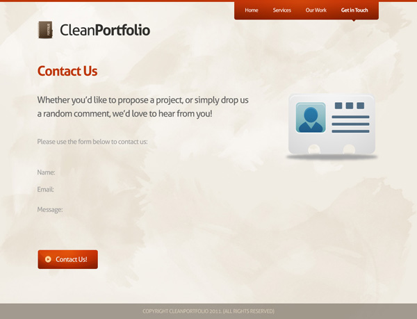
Change the cog icon to the contact icon found in the resources for this tutorial and change the text to suit your contact page:
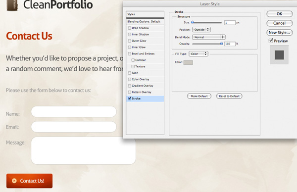
Now apply several white rounded rectangles (20px radius) to act as your contact form.
To add more definition to these areas give them a subtle stroke blending option:
Stroke Blending Option Settings:
Size: 1px
Position: Outside
Blend Mode: Normal
Opacity: 100%
Color: ccc9c2
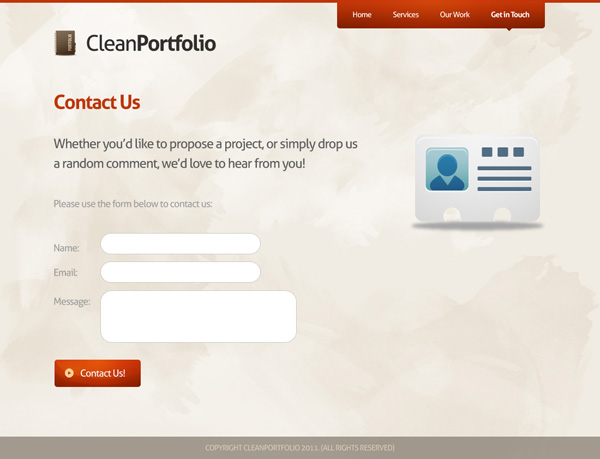
You can see the final contact form below. Simple and effective!
Step 15
For the final portfolio page repeat the same technique again.
This time replace the contact icon with the large portfolio icon from the resources to this tutorial.
Also include several small thumbnails to show examples of your work:
Free to Use!
And there you have it! How to create a simple, effective and professional portfolio website, including subpages.
This is essentially the work process I use for all of my web design projects and it’s very efficient.
I hope that you enjoyed this tutorial, and please feel free to use it for any of your own personal projects. I’d love to see a coded version of this design if anyone gets to that stage.
And We’re Done!
You can view the final outcome below. I hope that you enjoyed this tutorial and would love to hear your feedback on the techniques and outcome.
VIP Download
Download the original .psd file for this tutorial here:

 Members Area Tutorial: Design a Heavily Textured Portfolio Website
 Members Area Tutorial: Create a Dark, Professional Landing Page
 Members Area Tutorial: Design a Clean, Engaging Church Website

Leave a comment
0 Comments:
No comments have been posted yet. Be the first!
Leave a Comment: