
Members Area Tutorial: Design a Clean, Engaging Church Website
NOTE: Apologies for the delay in uploading the final version of this tutorial. With the original upload we had reports of a corrupted file, and so have had to work around to fix this issue. The source file is totally fine now, and we hope that you enjoy the tutorial.
Resources Used In This Tutorial
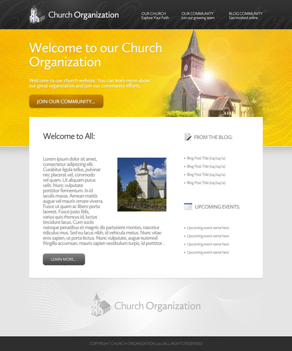
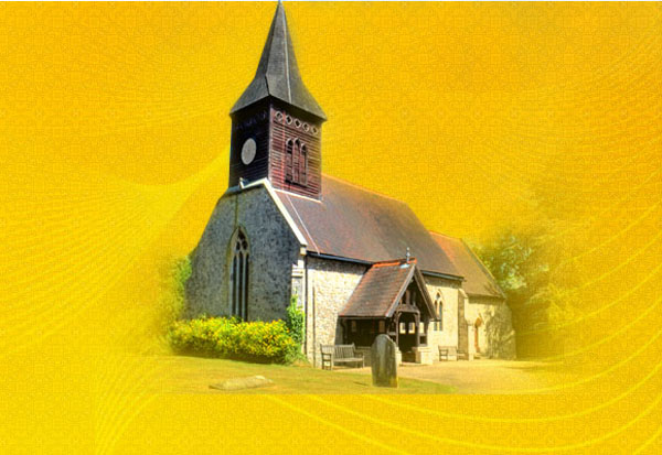
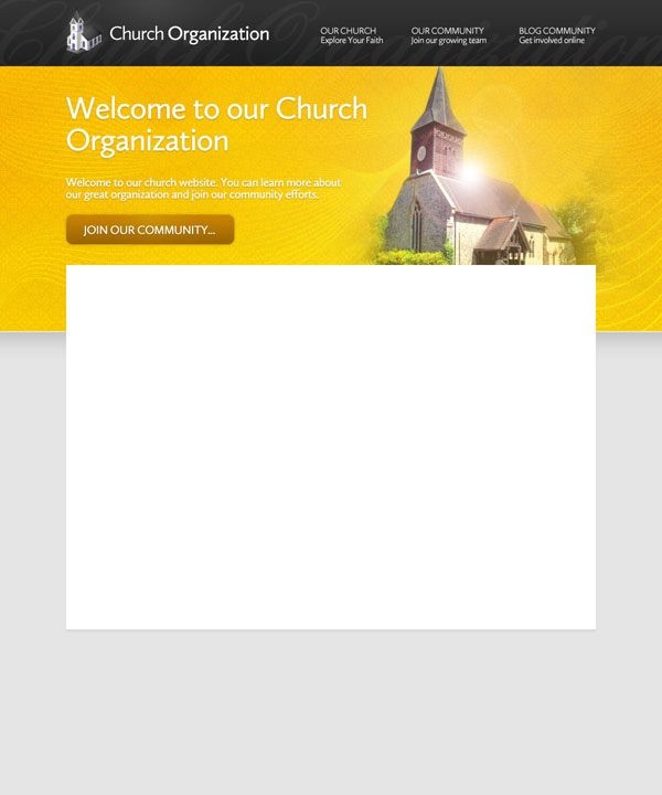
Final Image
Here is a preview of the image that we are going to be creating:
Step 1
Start by creating a new document (1000X1200px). Then create some guides to help map out your layout.
Vertical Guides:
100px, 600px, 625px, 900px
Horizontal Guides:
100px, 400px, 500px, 950px

Step 2
Create a new layer called ‘background main’.
Using your guides, create a rectangular area, filled with a linear gradient ranging from ffb400 to ffcc00.

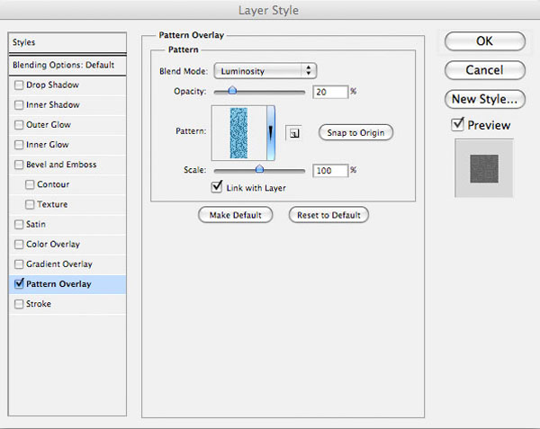
Now apply a pattern overlay blending option. I used a SquidFingers pattern.
Pattern Overlay Blending Option:
Blend Mode: Luminosity
Opacity: 20%
Pattern: Squidfingers pattern
Scale: 100%

Step 3
Now create a new layer called ‘highlight’.
Drag out a white to transparent radial gradient over your orange background area.
Then change this layer’s blend mode to ‘overlay’ and reduce the layer’s opacity to 30%. The images below show the highlight layer at normal blend mode, and then at ‘overlay’ blend mode 30% opacity:


Step 4
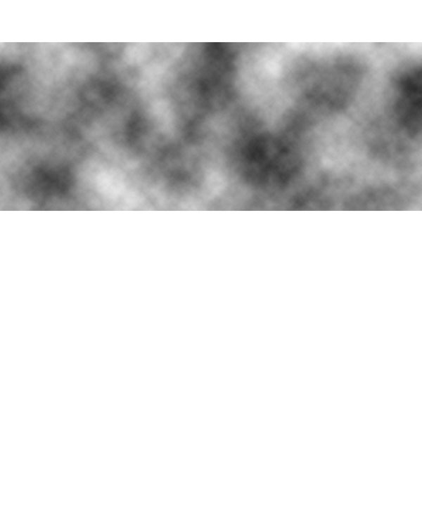
Now in your layer’s palette option+click on your ‘background main’ layer. This will select your orange area.
With your selection in place, create a new layer called ‘clouds’. Go to filter>render>clouds to render some nice looking clouds. Then change this layer’s blend mode to ‘overlay’, and reduce it’s opacity to 15%. This adds a nice extra texture to your welcome area:

Step 5
Now download the fractal brush set from the resources for this tutorial.
Apply several of the brushes from the set (using a white paintbrush) over your orange welcome area.

Then change this layer’s blend mode to ‘overlay’ and reduce the layer opacity to 40%.

Finally, apply a layer mask, and use a soft, black paintbrush (around 20% opacity) to blend the fractal brushes together nicely.

Step 6
Now paste in the church photo from the resources for this tutorial.
Position it in the top-right of your orange welcome area.
Then apply a layer mask, and use a soft black paintbrush to mask off the background. To handle the finer areas such as the more precise steeple, zoom in, and use a smaller black paintbrush. Take your time with the masking, to ensure that it’s precise.


Step 7
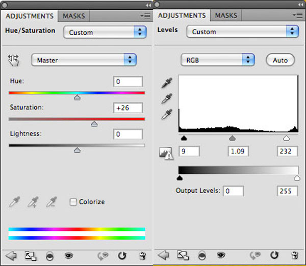
Now apply two adjustment layers, a hue/saturation layer, and a levels adjustment layer.
For each adjustment layer apply a clipping mask so that the adjustments only effect the church photo, not your entire canvas.
Hue/Saturation Adjustment Layer Settings:
Hue: 0
Saturation: +26
Lightness: 0
Levels Adjustment Layer Settings:
9 / 1.09 / 232
Step 8
Now apply a new layer called ‘lens flare’.
Fill your canvas with black. Then go to filter>render>lens flare. Apply a 50-300mm Zoom flare, 100% brightness.
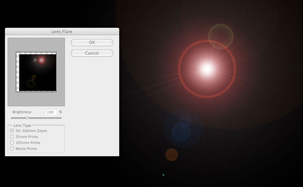
Now change this layer’s blend mode to ‘screen’. This will hide the black part of your layer, just letting your lens flare show through. This means that you’re applying your lens flare in a non-destructive way, which is always important to bear in mind:

Step 9
If you notice, the lens flare effect is a little bit red, which is distracting from the church image.
In order to fix this, apply a hue/saturation adjustment layer. Be sure to apply a clipping mask, so that your adjustments only effect your lens flare layer.

Step 10
Add some text to your welcome area, applying a drop shadow to make the text stand out more.
Welcome Text Settings (Headline):
Font Face: Calluna Sans
Size: 48pt
Color: ffffff
Kerning: -50
Styling: Bold
Welcome Text Settings (Under Text):
Font Face: Calluna Sans
Size: 18pt
Color: ffffff
Kerning: -50
Styling: Bold
Drop Shadow Settings (Applies to all welcome text):
Blend Mode: Multiply
Color: 000000
Opacity: 30%
Angle: 90 degrees
Distance: 1px
Spread: 0%
Size: 1px


Step 11
Now behind the ‘Join Our Community’ text, create a rounded rectangle button (10px radius).
Apply a drop shadow, gradient overlay and stroke blending option (settings below):
Drop Shadow Settings:
Blend Mode Multiply
Opacity: 20%
Angle: 90 degrees
Distance: 1px
Spread: 0%
Size: 3px
Gradient Overlay Settings:
Blend Mode: Normal
Opacity: 100%
Gradient, ranging from: 9b6600 to c88300
Angle: 90 degrees
Stroke Settings:
Size: 3px
Position: Outside
Blend Mode: Normal
Opacity: 6px
Color: 000000


Step 12
Now create a new layer called ‘button highlight’.
In your layer’s palette option+click on your button layer to select it. Then with your selection in place, return to your ‘button highlight’ layer.
Drag out a white-transparent radial gradient from the top-center of your button. Then change this layer’s blend mode to ‘overlay’ and reduce it’s opacity to around 15%.

Step 13
Create a new layer called ‘gray area’ and fill the space below your welcome area with ‘e5e5e5′.

Step 14
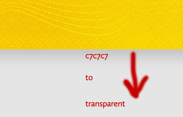
Create a layer called ‘dark top’.
Now drag a c7c7c7 to transparent linear gradient down from the top of your gray area.
This will help add definition and depth to this part of your layout.
Now add a 1px white line as a divider at the top of this gray area, just to help separate the two layout sections.

Step 15
Now create a new layer called ‘header bg’.
Fill the top 100px of your design with a linear gradient ranging from 333333 to 202020.

Now use the same technique that you used earlier to highlight the call-to-action button. Start by selecting your entire header area (option+click on your ‘header bg’ layer in your layers palette). Then with your selection in place, create a new layer called ‘header highlight’. Drag out a white to transparent radial gradient from the top left of your header. Then reduce this layer’s opacity to 35% and change the layer blend mode to ‘overlay’.

Step 16
Now add some scripty white text to your header. This will act as a very subtle backdrop for your header content. Reduce the opacity of this layer to 4%.


Step 17
Now paste in the church icon from the resources for this tutorial. Next to this apply some logo text:
Logo Text Settings:
Font Face: Cullana Sans
Size: 30pt
Kerning: -50
Color: ffffff
Styling: bold

Step 18
Now type out some menu text in the right area of your header.
Menu Text Settings:
Font Face: Cullana Sans
Size: 14pt
Kerning: -50
Color: ffffff
Styling: bold

Step 19
Just to review, this is where we are at with our design currently:

Step 20
Now create a new layer called ‘white area’.
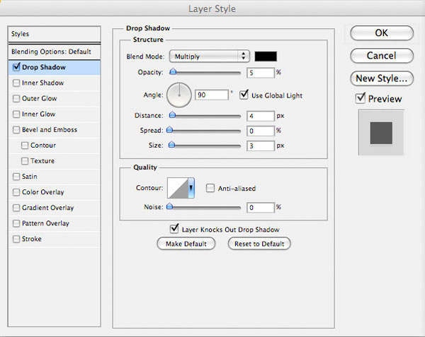
Using your guides lay out a white content area beneath your welcome area. To add emphasis to this area, add a drop shadow blending option (settings below):
Drop Shadow Settings:
Blend Mode: Multiply
Color: 000000
Opacity: 5%
Distance: 4px
Spread: 0%
Size: 3px
Step 21
Now type out some text over your white content area.
Welcome Heading Text Settings:
Font Face: Cullana Sans
Size: 30pt
Kerning: -50
Color: 353535
Styling: Normal
Welcome Under Text Settings:
Font Face: Cullana Sans
Size: 18pt
Kerning: -50
Color: 787878
Styling: Normal
Sidebar Text Settings:
Font Face: Cullana Sans
Size: 14pt
Kerning: -50
Color: 787878
Styling: Normal

Step 22
Now paste in your second church photo, as well as your blog/events icons. Position these to fit in with your content, using your layout guides to assist you in positioning them:

Step 23
Add a call-to-action button under your welcome text. To create the button, create a rounded rectangle shape (10px radius) and apply a drop shadow, gradient overlay and stroke blending option:
Drop Shadow Settings:
Blend Mode: Multiply
Color: 000000
Opacity: 20%
Angle: 90 degrees
Distance: 1px
Spread: 0%
Size: 3px
Gradient Overlay Settings:
Blend Mode: Normal
Opacity: 100%
Gradient: 454545 to 808080
Angle: 90 degrees
Stroke Settings:
Size: 3px
Position: outside
Blend Mode: Normal
Opacity: 6%
Color: 000000


Step 24
In your layers palette return to your gray background layers. Create a new layer called ‘footer highlight’.
Drag out a white to transparent radial gradient in the footer area of your layout.
This will add a nice area of focus to the bottom of your design.

Now create a new layer called ‘footer brush marks’.
Apply your fractal brushes to your footer (using a white brush). As with your welcome area, be sure to mask off the edges of your brush marks, to smoothly blend them into your background. This should create a nice level of extra detail for your footer:

Step 25
Now you want a watermark version of your logo added to your footer area.
Rather than individually pasting back in the logo icon, retyping the text etc… it’s easier simply to create a layer folder within your layer palette, and put all layers relevant to your logo in this. Then simply duplicate this layer folder, and move the duplicate to the correction position in your footer.
To give a watermark effect, simply reduce the opacity of your logo icon layer, and change the color of your logo text to light gray.

Step 26
Create a new layer called ‘footer’.
Using your guides, fill the bottom 50px of your canvas with 2e2e2e. Then apply an inner shadow blending option to this layer, just to give a bit more depth:
Inner Shadow Settings:
Blend Mode: Multiply
Color: 000000
Opacity: 20%
Angle: 90 degrees
Distance: 4px
Choke: 0%
Size: 0px

Step 27
Now to finish, add some copyright text to your footer.
Copyright Text Settings:
Font Face: Cullana Sans
Size: 14pt
Kerning: -50
Color: 767676
Styling: Normal

And We’re Done!
You can view the final outcome below. I hope that you enjoyed this tutorial and would love to hear your feedback on the techniques and outcome.
VIP Download
Download the original .psd file for this tutorial here:

 Members Area Tutorial: Design a Professional Ecommerce Website
 Members Area Tutorial: Design a Heavily Textured Portfolio Website
 Members Area Tutorial: Design a Rocking Grungy Band Website

Leave a comment
0 Comments:
No comments have been posted yet. Be the first!
Leave a Comment: