
Create a Unique Staircase Text Effect That Will Blow Your Viewer’s Minds
Don’t you just love unique Photoshop effects that aren’t seen everywhere? They have so much more impact on your end audience!
In this lesson I will be showing you guys how to create the illusion that your type is applied to a multi-level staircase. It sounds quite simple, but in order to achieve this sort of effect you will need to do quite a bit of planning and also be somewhat familiar with masks and how to link and unlink them.
I will also be showing you how to add perspective to your type in order to create depth, and then apply shading to enhance this even further.
If you are ready to get started then fire up Photoshop and let’s go!
Resources Used In This Tutorial
What You’ll Be Creating
Let’s take a look at a preview of the image that we are going to create:

Step 1
Anytime you are working in Photoshop and are planning on creating a piece that has some kind of structure such as a city with buildings, a street scene, or in this case stairs, you will need some kind of perspective guides.
While there are many ways to do this depending on whether you are working with one, two, or three point perspective, you want to basically create a single point and then make your guides come off of this point. There are many cases where you can have even more than three point perspective, and the focal point can be either visible, or off of the canvas.
As you might guess, you can go pretty in depth on this topic so what I have done is set up some guides for you. To get things started we are going to grab the ‘Guides.psd’ file from the source folder and open it up in Photoshop.

Step 2
Once you have opened up the PSD file you will see the guides contained in a Group Folder. We will be using this to help us build our steps.
The first thing we want to do is create a new layer above the guides and with a condensed white typeface (I am using Helvetica Neue Bold Condensed) we are going to type out the word ‘Photo’ as shown below:

Press Command/Ctrl + J to duplicate this layer and move it below your original layer. Change this type to the word ‘Shop’ so that it’s left aligned with ‘Photo’ like this:

Your layers should now look like this:

You want to make sure that the spacing between the letters of each word is consistent. This is also referred to as the kerning. An easy way to manually adjust the kerning in Photoshop is to place your type cursor between the two letters that you want to increase or decrease the space between and then press Alt/Option plus your right or left arrow keys respectively. By pressing Alt/Option with the right arrow, you will add more space between your letters, and the left arrow will reduce the amount of space.
Step 3
Select your first type layer, and then select the second layer while holding down the Shift Key to select them both simultaneously. Once both layers are highlighted, press Command/Ctrl + G to place them into a Group Folder. Name this folder ‘Live Type’ as shown below:

After creating this folder, grab it and drag it down to the New Layer Icon at the bottom of your Layers Palette. This will create a duplicate of the entire folder. Move this layer below the previous folder and call it ‘Rasterized’ as we will be converting this group to raster images rather than editable type.

Step 4
Next, turn the visibility of the ‘Live Type’ Group Folder off and then expand the ‘Rasterized’ folder below to reveal the layers inside.

Select both of these layers and then hold down the Control Key and click on either one to reveal a dropdown menu. From this menu, choose ‘Rasterize Type’ as shown below:

We now have our original, editable type in a folder, as well as our converted type which is now a shape rather than editable text. Since we will be doing one word at a time, we are going to turn off the ‘Shop’ layer for the time being.

Step 5
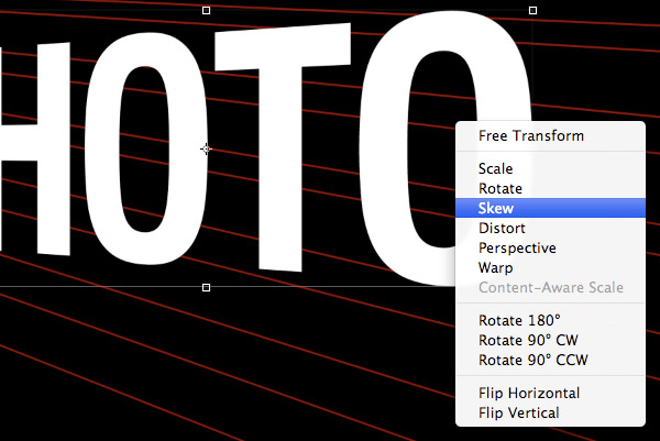
With your ‘Photo’ layer selected, press Command/Ctrl + T to initiate a Free Transform Command. After doing that, hold down the Control Key and click on the type on your canvas. Once the dropdown menu appears, choose the ‘Perspective’ option.

Hold down the Shift Key and pull the bottom right corner of the bounding box downwards. Doing this will make the right side of the type come forward so that it looks something like this:

Hold down the Control Key once again and click on the type to bring the dropdown menu back. This time we re going to choose the ‘Skew’ option.
Move your cursor over the right side of the bounding box and move the box downwards so that the top of the letters are in line with the top guide.

Once you have your type skewed and lined up, press the Enter Key to apply the changes.
Step 6
After positioning your type and applying the changes press Command/Ctrl + J to duplicate this layer so that we can work off of this copy. Then, turn the visibility of the original raster layer off.

From here, switch over to your Pen Tool (P) and follow the top red line across the canvas. Go up and around the type and then close the shape. Hold down the Control Key and click anywhere along the path to reveal the dropdown menu. From this menu we are going to choose ‘Make Selection’ as shown in the image below:

When prompted with the next dialog box we can just go ahead and click OK to bypass this option as long as the ‘Feathered Radius’ option is set to 0.

You should now see the marching ants around your shape indicating the active selection area. Next, click on the Layer Mask Icon at the bottom of your Layers Palette indicated by the red box in the image below:

You should now have something like this:

Step 7
Select your masked type layer and then press Command/Ctrl + J to duplicate it. Move this layer below the previous one and then hold down the Control Key and click on the mask that is attached to the layer. From here, choose ‘Delete Layer Mask’ to remove it.

Press Command/Ctrl + T to initiate a Free Transform once again and this time we are just going to choose ‘Skew’ from the dropdown menu.

Move your cursor over the bottom/middle of the bounding box and slide it to the left so that the type is on an extreme slant like the image below:

Use your Pen Tool (P) once again and draw a shape following the next two guidelines below the first one and close the shape. Hold down the Control Key and click along the path once again before choosing ‘Make Selection’ like we did in the previous step.

Once your selection is active, click on the Layer Mask Icon at the bottom of the Layers Palette so that only the area inside of this shape is visible. Your type should now look like this:

Step 8
Select the first raster type layer that we adjusted and make another copy by pressing Command/Ctrl + J.

Remove the Layer Mask once again like we did in the previous step.

Use your Pen Tool (P) to create a shape between the next set of guides before applying a NEW Layer Mask to replace the former one and position your type so that it connects to the edges of the previous layer above it.

This is the process that we will be using to build the effect. You can see where it is going by the few steps we have already completed.
Step 9
Copy the adjusted raster layer once again and delete the Layer Mask. Move this layer below the others to keep everything in order.

Use a Free Transform to skew this layer to create that extreme angle where the step comes forward.

Continue to use the guides here to create another new shape and once your selection is active apply a Layer Mask to your raster type layer.

We will continue this step and repeat process until we have completed the remainder of the word.
Step 10
Select all of the layers that make up your first word by clicking on the top layer, holding down the Shift Key, and then clicking on the bottom layer.

With all of your layers highlighted in your palette, press Command/Ctrl + G to put them into a Group Folder and name it something easy like ‘Photo’ as shown here:

Step 11
Next, select your ‘Shop’ raster type layer and press Command/Ctrl + J to duplicate it. You can leave the visibility of the original raster layer turned off.

We will now do what we did when we first began to modify our first word and apply a Free Transform (Command/Ctrl + T) and then proceed to use the ‘Perspective’ and the ‘Skew’ options to line your type up with the next guide.

Use your Pen Tool to follow the guide and create a shape around the top of the type before applying your Layer Mask.

Copy your layer, delete the Layer Mask, and then skew the type just like we did in the previous word in order to create that slant to make it look like it’s on a step.
Once you have it matched up to the letters above, apply a new Layer Mask.

Step 12
Continue this process to build out the remaining sections of your word. At some point you may encounter an issue where you just can’t get all of your letters to match up correctly. If and when this happens, have no fear! I can show you a workaround to correct this problem.
If you look at your Layers Palette you will notice that there is a small link icon between your Layer and your Layer Mask. Click on this icon to un-link the two. The image below shows the layer that is now un-linked.

Next, grab your Lasso Tool (L) and draw a selection around the section that you want to tweak. This can be a whole letter, or even a part of a letter. In this case I am selecting the legs of the ‘H’ to match them up.

After you have matched up your letters, remember to turn the link back on between your Layer and Layer Mask.

Step 13
Keep working away until you have completed the second word. Once you have done that, select all of the ‘Shop’ layers and put them into a Group Folder of its own beneath the ‘Photo’ Group Folder as shown below:

Select both of these Group Folders together and drag them down to the New Layer Icon at the bottom of the Layers Palette to create duplicates of both of them.

With both of your duplicated Group Folders selected, press Command/Ctrl + E to merge them together into one shape. You can now turn the visibility of the original Group Folders off.

At this point I am just going to select all of the layers that I am not using and putting them into a single Group Folder of their own. Your Layers Palette should look something like this:

Step 14
Create a new layer above your merged raster layer and make sure that your ‘Guides’ are still visible as well.
What we are going to do next is zoom into the image and fix any jagged edges where the letters meet. We want this to look clean so we will just use our Pen Tool (P) to create shapes that will connect these edges as seen below:

Fill these shapes with solid white and make sure that you look over each corner of every letter for efficiency. Once you’re done you can merge these two layers together.

Step 15
Create a new layer above your merged raster layer and use your guides to create a shape around the first top piece of the word ‘Photo’ as shown here:

Close the shape and make a selection so that you see the marching ants indicating your active selection area. Once your selection is active, switch to your Gradient Tool (G) and make sure that you have a Linear Gradient selected that fades from black to transparent.

On your new layer, click and drag your mouse upwards to create a gradient inside of this shape.

Repeat this process for the next section below, only this time drag your gradient from the top down. Essentially, all of the front facing sections you will make a gradient going from the bottom up, and then all of the top facing sections you will do the opposite where your gradient goes from the top down.
Step 16
In the image below I only have shading of the top facing sections turned on. Hold down the Command/Ctrl Key and click on each of these layers so that they are all highlighted simultaneously.

With your top facing shadows selected, press Command/Ctrl + E to merge them together.

Do the same for your front facing shadows and merge them together into one layer as well. Name each of these layers respectively so that you have a ‘Top Shadows’ and a ‘Front Shadows’ layer for each of these groups of shadows.

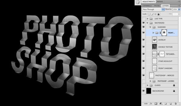
Select both of your shadow layers simultaneously by clicking on them while holding down the Shift Key and then press Command/Ctrl + G to put them into a Group Folder above your type layer.
Your Layers Palette should now look like this:

Step 17
Open up the grunge texture and bring it into your Photoshop document. Place the layer just above your ‘Shadows’ Group Folder.

Change the Blending Mode of the texture layer to Overlay and reduce the opacity to about 35-40%.

Step 18
With your ‘Top Shadows’ layer selected, click on the Layer Mask Icon indicated in the image below:

Use a low opacity soft brush to remove some of the shadows on the right side of the words.

What we want to do now is remove some of the shadows from each of the upper right of each of the shapes. This will help to create the illusion that the top piece is reflecting onto the piece below.

Step 19
Switch back to your Gradient Tool (G) and make sure that you have a Linear Gradient selected that fades from solid white to transparent.

Create a new layer above the ‘Front Shadows’ layer and using your Gradient Tool (G), drag your mouse from the right side of the words over to the left to create a highlight. Reduce the opacity of this layer to about 60% so it’s not as intense.

Step 20
Create a new layer and place it above the texture layer as shown below:

Hold down the Command/Ctrl Key and click on the layer thumbnail icon of your merged raster type layer to active a selection around it. You should now see the marching ants around the outside of your words.
Fill your new layer with solid black and then change the Blending Mode of the layer to Overlay before reducing the opacity to about 25-30%.

Step 21
Create a new layer above the previous layer and fill it with solid black. Leave the Blending Mode of this layer set to Normal but reduce the opacity to 50%.

With your black fill layer still highlighted, hold down the Command/Ctrl Key and click on the layer thumbnail icon of the ‘Top Shadows’ layer as indicated by the image below:

Press Command/Ctrl + Shift + I to inverse the selection, and then click on the Layer Mask Icon at the bottom of the Layers Palette. At this point the fill is only visible on the front facing pieces of your words.

With your fill layer selected, press Command/Ctrl + G to put this layer into a folder.

Step 22
With your new folder selected, click the Layer Mask Icon at the bottom of the Layers Palette to add a mask.

Switch over to your Gradient Tool (G) and make sure that you have a Radial Gradient selected that fades from solid black to transparent.

Click and drag your mouse outwards from the center of the words outwards to remove the black fill from the center.
Step 23
Select your ‘Front Shadows’ layer and add a Layer Mask to it by clicking on the icon at the bottom of the Layers Palette.

Switch to your Gradient Tool (G) and make sure that you now have a Linear Gradient that fades from black to transparent as shown below:

Click and drag from the bottom right corner towards the upper left of the canvas to remove some of the shadows from the bottom corner.

Step 24
Select your merged raster type layer and then press Command/Ctrl + J to duplicate it. Move this layer above the ‘Shadows’ Group Folder and then change the Blending Mode to Overlay.

Add a Layer Mask to this layer and then grab your Gradient Tool (G) once again. Use the same settings as before – Linear Gradient fading from black to transparent.

This time, drag your mouse from the upper left to the bottom right at a slight angle to remove some of the strong highlight on the left side.

Step 25
Select the grunge texture layer and then hold down the Command/Ctrl Key and click on the layer thumbnail icon of the merged type layer to activate a selection around your words.

While your selection is still active, click on the Layer Mask Icon at the bottom of the Layers Palette to mask the texture so that it’s only visible inside of the letters.

Duplicate this grunge layer and move it below the original merged type layer.

Hold down the Control Key and click on the Layer Mask of the layer and then select ‘Delete Layer Mask’ from the dropdown menu.

Reduce the opacity of the texture layer to about 55-60% as shown below:

Step 26
At this point we are going to add a subhead or an additional line of smaller copy below the staircase type. Make sure to check your kerning so that the spacing between the letters looks good and doesn’t have any weird spaces or uneven gaps.
Once you’re happy with the type, duplicate the layer by pressing Command/Ctrl + J and then hold down the Control Key and click on the layer. When the dropdown menu appears, rasterize the type to convert it to a shape and turn the visibility of the live type off.

Use the Free Transform Command once again to put the type in perspective below the word ‘Shop’ and use the bottom of the letters as a guide for helping you to line it up correctly.

After modifying the type you should now have something like this:

You will notice that I have added a few effects to the type in the image above. To replicate these effects, double click on the layer to bring up the Layer Style Dialog Box and check off the ‘Gradient Overlay’ option as well as the ‘Color Overlay’ option.
For the Gradient Overlay settings, use the image below as a guide:

For the Color Overlay we want to use a solid black color and reduce the opacity to about 46%.

Press ‘OK’ or hit the Enter Key to apply the settings to your type.
Step 27
Create a new layer just above the bottom texture layer and use your Linear Gradient (G) to darken the bottom left corner of the image. Make sure you are still using the gradient that fades from black to transparent. This will help to make the bottom left corner recede further into space.

The last adjustment we will make is just to reduce the opacity of the background texture a bit further so that it’s set to 50%.

Step 28
At this point make sure to save your work if you haven’t already done so. Hopefully you have been saving throughout the tutorial!
Feel free to add any other lines of copy or embellishments to finish off your design. I hope you guys have learned some useful techniques from this and will be able to apply some of this to your own projects!
Thank you for following along and we will see you next time.
And We’re Done!
Awesome job making it this far! You should be proud of what you’ve created. Show it off to your friends and colleagues and get some feedback.
You can also comment here with your version, or any questions you had about the techniques used. We love to see what you guys create and we’re always here to give helpful feedback and tips to help you to improve.
Download the Source Files for This Tutorial
Download the original .psd file and accompanying resources you need to complete this tutorial:

 Members Area Tutorial: Create an Amazing 3d Text Effect
 Members Area Tutorial: Create an Advanced Stone Text Effect in Photoshop
 Create a Textured Wooden Text Effect Using Photoshop’s 3D Capabilities

Leave a comment
0 Comments:
No comments have been posted yet. Be the first!
Leave a Comment: