
Members Area Tutorial: Create a Mystical Floating Chinese Symbol Landscape
Resources Used In This Tutorial
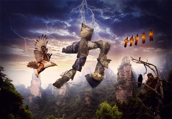
Final Image
Here is a preview of the image that we are going to be creating:
Step 1
Create a new document (2000X1400px).
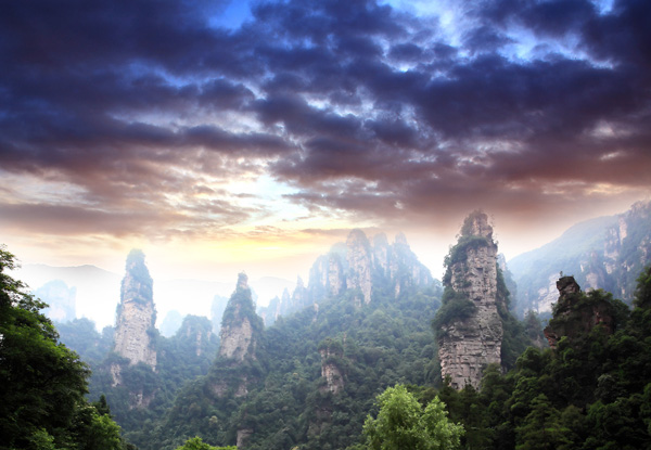
Start by pasting in your ‘moody sky’ photo from the resources for this tutorial:

Apply a levels and color balance adjustment layer (applying a clipping mask to each):
Levels Adjustment Layer Settings:
19 / 0.89 / 230
Color Balance Adjustment Layer Settings:
Highlights: +12 / +1 / +6
Midtones: +15 / +1 / +9
Shadows: +4 / -1 / -5


Step 2
Paste in your landscape photo, positioning it over your original moody sky photo:

Apply a layer mask to this layer, and use a medium sized, soft black paintbrush to mask off the top of your photo, exposing your sky photo underneath:
To help blend this landscape better with our sky apply a levels and color balance adjustment layer (giving each a clipping mask).
Levels Adjustment Layer Settings:
11 / 0.95 / 255
Color Balance Adjustment Layer Settings:
Highlights: +15 / -5 / -11
Midtones: +9 / +6 / +1
Shadows: +11 / -4 / -16


Step 3
We want to focus the attention of this piece primarily in the center. To help achieve this create a new layer called ‘fade top of sky’.
Select a large, soft paintbrush (50% opacity), color: 1a1b45. Brush over the top corners of your sky, thus hiding some of the details in these areas:

Step 4
We want to try and make the lighting a little more uniform in our composition so far, so it’s time to create our first of many dodge/burn layers.
Usually I would wait until the end to dodge/burn my image but I find it can give more control to create several at different stages of your composition, and therefore build up a more natural lighting for your piece.
Remember – we always want to dodge/burn our image in a non-destructive way.
Create a new layer called ‘dodge/burn’. Go to edit>fill>fill with 50% gray. Then change this layer’s blend mode to ‘overlay’. This will hide your 50% gray fill but allow you to paint black/white over your piece.
Use a soft, low opacity black paintbrush to burn your image, and a soft, low opacity white paintbrush to dodge it. Try to identify the main light sources in your piece and accentuate them. The idea is to try and blend your various landscapes into a single cohesive background.
The images below show your dodge/burn layer landscape at ‘normal’ blend mode and then ‘overlay’ blend mode:


Step 5
Create a new document roughly 900X900px.
Select your ‘elliptical marquee selection tool’ and set the ‘feather’ to 30px.
Create a central circular selection and then with your selection in place go to filter>render>clouds.

We want to create a cool ripple effect. To achieve this go to filter>distort>zigzag. Apply the following settings:
ZigZag filter settings:
Amount: 100%
Ridges: 8
Style: Pond Ripples

Step 6
Go to layer>rasterize>layer to rasterize your object. Then copy/paste it back into your original document.
Position your ripple above one of your stone pillar structures.
Go to edit>transform use your transform tools such as the perspective tool, scaling tool and distort tool to squash your ripple to look like the image below:

Apply a layer mask to this layer. Use a soft black paintbrush at around 25% to mask off the edges of your ripple area, blending them into your background. Also brush over your main area of ripple making it fainter and more natural looking:

Change this layer’s blend mode to ‘vivid light’ and reduce it’s opacity to 30%:

Step 7
Create a new layer called ‘lightning bolts’.
Download the lightning bolts brush set from the resources for this tutorial.
Apply several of the brushes using a white paintbrush. You want to paint lightning bolts over your moody sky, but also arcing down to clash into your rock pillars:

Apply a layer mask, and use a soft black paintbrush to blend your lightning bolts into your sky etc…

Now apply an outer glow blending option to your lightning layer. This should give it a natural looking glow.
Outer Glow Blending Option Settings:
Blend Mode: Screen
Opacity: 33%
Noise: 0%
Color: f7f3d7
Spread: 0%
Size: 21px


Step 8
Paste in or draw out the following chinese symbol over the center of your composition:
This symbol represents ‘power’:

Step 9
Download the ‘rocks’ images from the resources for this tutorial.
Open them in photoshop, and cut out the rocks from their backgrounds. Paste this rocks into your main document and position/resize them to fit over your chinese symbol:


Step 10
Create a new layer beneath your rock layers called ‘glow around symbol’.
Use a low opacity white paintbrush to brush a highlight glow around your symbol. It should be subtle, but help your letter stand out:

You’ll notice that the rocks are looking a little flat at the moment. To fix this, apply a dodge/burn layer (just like you did with your original dodge/burn layer). Dodge/burn your rocks to make them appear rounder and more defined:


The rocks are looking much better, but their color is still slightly off.
We want to apply a color balance adjustment layer to fix this. However, we want to use one adjustment layer over all of our rocks, rather than applying an adjustment layer to each rock layer.
To do this, simply apply an adjustment layer WITHOUT creating a clipping mask for it.
Start by creating a color balance adjustment layer with the following settings:
Color Balance Adjustment Layer Settings:
Highlights: +6 / -9 / -11
Midtones: +18 / -9 / -16
Shadows: +5 / -5 / -4

Now because you didn’t create a clipping mask for your color balance adjustment layer, your adjustments will effect your entire canvas. To fix this, select the layer mask for this adjustment layer, and then fill your entire canvas with black. This will effectively mask off all of your adjustments.
Then, with your layer mask still selected, use a soft white paintbrush (100% opacity) and brush over your rocks. This will unmask this area of your adjustment layer, allowing your adjustments to show through. Therefore your rocks will have changed color, whilst your main composition remains the same!
If you look below you can see the adjustment layer thumbnail and mask. The black area has been masked off, whilst the white is where you have painted back in your adjustments:

Step 11
Time to apply some cool details to our chinese symbol.
Create a new layer called ‘cracks’. Download the cracks brush set from the resources section for this tutorial.
Apply several of the cracks over your symbol using a white paintbrush:

Apply an outer glow blending option to your cracks layer.
Outer Glow Blending Option Settings:
Blend Mode: Screen
Opacity: 75%
Noise: 0%
Color: 3c3660 to transparent
Spread: 0%
Size: 16px


Step 12
Download the ‘zen wood’ image from the resources for this tutorial.
Extract the wood from it’s background and paste it into your original document:

Apply a hue/saturation adjustment layer (being sure to create a clipping mask for this layer).
Hue/Saturation Adjustment Layer Settings:
Hue: +15
Saturation: 0
Lightness: -50

Now duplicate your wood layer. Select the underlying wood layer and move it down several pixels and to the right several pixels. We’re going to turn this wooden shape into a shadow of the top wood layer.
Select all of the data on this layer (option+click on the layer in the layers palette).
Fill your wooden selection with black. Then go to filter>blur>gaussian blur. Apply a gaussian blur of 2.4 pixels strength.

Finally, you’ll notice that the shadow layer casts a shadow over the sky as well as the rock formation. Of course we only want our top wood layer to cast shadow on the rocks, to create a realistic lighting effect.
To fix this create a layer mask for your shadow layer. Mask off all of the shadow apart from that which goes over your rock formation.

Step 13
Repeat step 12, applying further areas of wood growth over your rocks:

Step 14
Download the nest image from the resources for this tutorial.
Open this in a new document. Then go to select>color range. Use your eye dropper tool to click on the white background. Then set your ‘fuzziness’ to 60. Hit ok, and your background should be selected:

Go to select>inverse to invert your selection. This will leave just your nest selected. Copy and paste this into your original document, and resize it to sit at the bottom of your rock formation:

Now apply a color balance adjustment layer to your nest layer:
Color Balance Adjustment Layer Settings:
Highlight: -12 / -6 / -13
Midtones: -9 / -5 / -13
Shadows: +1 / +4 / -12


Create a new layer called ‘nest shadows’. Use a soft black paintbrush (30% opacity) to brush over the bottom of your nest, blending it into the underlying rock, and creating a realistic shadow underneath.

Step 15
Open up the ‘eggs’ photo from the resources for this tutorial.
Cut them out from their background and paste them into your original document. Position the eggs over your nest:

Apply a color balance adjustment layer to your egg layer in order to blend them better with the surrounding composition.
Color Balance Adjustment Layer Settings:
Highlights: +8 / +1 / -9
Midtones: +19 / -5 / -19
Shadows: +8 / +4 / -8

FInally, use a soft black paintbrush (around 20%) to paint a shadow over the bottom of your eggs:

Step 16
Open up the eagle image from the resources section for this tutorial.
Cut this out from it’s background (you can just use the magic wand tool for this). Paste the eagle into your document, positioning it like below:

Apply a color balance adjustment layer to your eagle layer.
Color Balance Adjustment Layer Settings:
Highlight: +4 / 0 / -11
Midtone: +15 / -4 / -6
Shadows: -4 / -5 / +12


Finally, duplicate your eagle layer. Select the bottom eagle layer and reduce it’s opacity to 50%. Go to filter>blur>motion blur. Apply a motion blur of 500 pixels.
Finally, your blur will blur out both sides of your eagle. You only want your blur to be coming from behind your eagle, so apply a layer mask and mask off the blur in front of your eagle:

Step 17
Open up your ‘raven on branch’ photo from the resources for this tutorial.
This takes some cutting out from it’s background, so just use care and attention to detail.
Paste it into the bottom right of your canvas:

Apply an inner shadow blending option to your ‘raven on branch’ layer. This should give the impression of the branch/bird being lit from above by your lightning storm.

Apply a levels and color balance adjustment layer (each with a clipping mask).
Levels Adjustment Layer Settings:
0 / 1.14 / 215
Color Balance Adjustment Layer Settings:
Highlights: +18 / 0 / -2
Midtones: +12 / -2 / -16
Shadows: +1 / -5 / +4


Step 18
Cut out and paste in your chinese lanterns. Position these in the top right of your canvas.
Apply an outer glow as the lanterns should be casting out a warm light:
Outer Glow Blending Option Settings:
Blend Mode: Screen
Opacity: 20%
Color: ffd86e
Spread: 0%
Size: 92px

Now apply a hue/saturation adjustment layer to your chinese lanterns layer.
Hue/Saturation Adjustment Layer Settings:
Hue: +24
Saturation: 0
Lightness: 0

Step 19
Create a new layer called ‘light spots (white)’.
Use a large, soft white paintbrush (100% opacity) to apply spots of light over key areas you want to highlight:

Now reduce this layer’s opacity to 20% and change it’s blend mode to ‘overlay’:

Create a new layer called ‘light spots (pink)’.
Apply several 7c505b colored brush marks over your canvas.

Reduce this layer’s opacity to 20% and change it’s layer blend mode to ‘overlay’:

Create a new layer called ‘light spots (blue)’.
Apply several large soft paintbrush marks over your canvas, using a blue (44569b) color:


Step 20
Create a new layer called ‘vignette’.
Use a low opacity, soft black paintbrush to paint around the edges and corners of your image, creating a vignette style effect, which helps focus attention on the central area of your composition:

Step 21
Create a final dodge/burn layer, using the same technique as your previous dodge/burn layers.
The images below show your dodge/burn layer at ‘normal’ blend mode and then ‘overlay’ blend mode:


Step 22
Apply a final adjustment layer, this time NOT applying a clipping mask, as you want these adjustments to effect your entire canvas.
Gradient Map Adjustment Layer Settings:
Gradient: default purple to orange gradient
Layer blend mode: Normal
Layer opacity: 10%

And We’re Done!
You can view the final outcome below. I hope that you enjoyed this tutorial and would love to hear your feedback on the techniques and outcome.
VIP Download
Download the original .psd file for this tutorial here:

 Members Area Tutorial: Design a Last Airbender Inspired Photo Manipulation
 Members Area Tutorial: Create Beautifully Lit Jellyfish Typography
 Members Area Tutorial: Design a Frightening, Textured Photo Manipulation

Thank you! There’s just something about this image…. LOL
Su
Thanks Su, I hope that’s a good ‘something’ . I’d love to see your take on this tutorial.